Every semester in my introductory classes, I do an assignment on push and pull factors, and how they relate to migration.  Of course, push and pull factors are a relatively easy concept to understand, in that push factors are those ideas about a place that “push” people away from living there, while “pull” factors are those perceptions which attract people.  It’s (really) old news for population geographers, and there have been plenty of critiques on the conceptualization, but it’s nice and tidy for getting intro-level undergrads interested in migration.

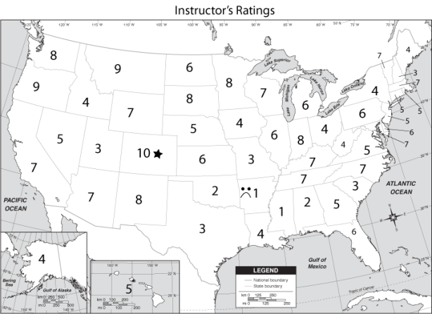
Usually, textbooks contain some sort of perception map to talk about this, based on mental maps of some undergrads at a random institution at which the textbook authors teach.  Like this one from whichever textbook:

That’s all well and good that a textbook shows this map, but it’ll maybe warrant a few seconds glance from the students (IF they open the text) and that’s it.  So, why not expand on the idea but have the students see what they think?

The assignment I give them is based on their own perceptions.  I have them simply pretend that they’ve graduated with their bachelors degrees and are now sought after by firms in every single state.  Then, I give them a map and have them rate, on first gut reaction, each of the 50 states a score of 1 (personal hell) to 10 (a land of milk and honey) as a potential place to live.  In groups, they come up with maps displaying averages of their ratings, and then the groups discuss why places are rated highly or lowly.  They’ve never got the resolution of analysis that the map above has, but it’s far more personal and links much better with what student interests are.

This, of course, leads into larger course discussions, like those about brain drain — few ever rate Ohio very well, and the power of perceptions — usually California and Hawaii are the most positively rated states, but few students have ever even visited either.  Of course, the discussion almost always touches on the lack of spatial resolution in this exercise, when one student gives New York a rating of 10 because they think NYC, but another gives it a 2 because the only New York they know is Buffalo.  It also leads nicely into topics like qualitative versus quantitative data, and serves as a really good gateway into healthy skepticism about statistical analysis, examining issues like sample size, interpolated data and other such critical thinking skills.

This semester, I put the assignment to two different classes at the University of Akron:

  • One Introduction to Geography course, mostly freshman with a few sophomores, 8:50am MWF.  The course enrollment is 41, but 30 were there to complete the assignment.
  • One Geography of Cultural Diversity course, all sophomores and juniors with two semesters of English composition as prerequisites., 11:00am TR.  The enrollment is 34, but only 25 were present that day.

Students were told to rate each state from 1 to 10, with 10 being the absolute best.  Beyond the ratings, they were to designate the absolute best with a star, and the absolute worst with a frown face.  After their group exercises and discussions, I collected the assignments and combined the data into some quickie maps, purposely ignoring cartography for sake of clarity, consistency and speed (really, I can do better!) and posted them on the course Facebook pages.  The results are what you see below.  I think they’re exceptionally interesting, not only in terms of which states are desired, but the differences between classes.

Map Set One: Raw Averages from Each Class. Averaged ratings from all students. Easy.


California’s the highest, followed by Hawai’i, Florida, North Carolina and South Carolina. Rhode Island is the worst, followed by North Dakota, South Dakota, Delaware and Connecticut.


In this class, North Carolina gets the highest accolades, followed by South Carolina, California, Ohio and New York. This class thinks that South Dakota’s the worst, followed by North Dakota, Nebraska, Minnesota and Idaho.

Map Set Two: “Stretched” Ratings from Each Class. Using some simple arithmetic, transformed the lowest rated state into a rating of 1, the highest rated into a rating of 10, and stretched the ratings in-between.  A good way to open the discussion about data manipulation as a true window into respondent intention.  Of course, the rankings will be identical.


Map Set Three: Best State Votes. A simple count of how many students, in each class, rated a state as the most preferred.


Not surprisingly, California received the most votes. More surprisingly, Florida got many more votes than Hawai’i (the second-highest rated state in this class).


In the course with more upperclass students, Ohio actually received the most votes, followed by the highest rated North Carolina, then California.


Map Set Four: Worst State Votes. A simple count of how many students, in each class, rated a state as the least preferred.


North Dakota and Alaska tie for being rated the worst most often, followed by Kansas. Note that Ohio received two votes, and class-wide favorite California was deemed the worst by one student.


In this case, North Dakota is joined by both Alaska Louisiana, followed by South Dakota and Texas. Notice that another favorite of this class, Florida, received one worst state vote.


Map Five: My Ratings. I always end up being asked what my ratings are, so I figured it’s fair to share.  I always make my own map and post it alongside the combined maps that I put on Facebook.  Here’s mine for this year… and oddly enough, it too changes every year.


That’s enough for now. Maybe I’ll revisit this topic later this week and include some of the students’ explanations behind their ratings.

The world’s went and gone crazy, and I stayed home.

With the widespread election of the GOP to wider public offices at all levels of government, public employees — specifically those in education — have come under attack.  Not only are budgets being slashed, but collective bargaining rights are being stripped from public employees in states like Wisconsin, Indiana, Idaho and yes, Ohio.  Unions have organized many protests against these actions, the most “successful” being those in Madison, where as many as 100,000 protestors descended on the capitol.  These efforts convinced the minority Democrats in the state senate to flee the state, stalling indefinitely the bill to ban public employees from collectively bargaining.

As freshly elected Republican governor John Kasich of Ohio asked for and ultimately received similar measures from his party’s majorities in the Ohio House and Senate, a similarly vehement if numerically smaller opposition began voicing objections through protests in Columbus.  Several colleagues traveled to Ohio’s capitol to voice their opinions in protest, and others helped to organize local showings of solidarity.

It’s odd. Even though I’m in full support of maintaining collective bargaining rights for all public employees, and though I fully oppose such unnecessary cuts to education, I specifically chose to not participate in any of this vocal opposition.  Why?  Because that very union that is now so threatened failed to protect people like me from being far more exploited by the public academic system.

See, I’m a part-time public employee, an “adjunct” faculty member in three different departments of two Ohio universities.  Though I have the same credentials and teaching experience as many of my full-time, tenure-track counterparts, and despite many attempts I have not been hired by any universities in this capacity.  Therefore, I am not represented by the Ohio Conference of the American Association of University Professors, or any other organization.

I typically teach between five and six courses per semester, and I am compensated an average of $900 per credit hour with no benefits.  In an average week, with preparing lectures, reading to maintain currency of knowledge for teaching, in-class instruction, office hours, grading, maintaining web course management, and other service tasks as assigned, I work approximately 60-65 hours per week.   This is in addition to the research and writing that I need to do to advance my career, and the job applications I constantly am working on for full-time positions. Occasionally I am awarded a couple of hours per week of assistance from a graduate student, though those hours are dedicated to one particular assignment. In other words, if I am awarded a GA by one department, that GA cannot work on my grading from a teaching assignment with another department.

Last year, for these efforts, I made about $28,000.  In terms of teaching (and admittedly, only teaching), I’m doing the jobs of between one and four faculty members.  According to The Chronicle for Higher Education’s faculty salary survey, assistant professors at my institutions, with generally smaller teaching loads, averaged over $54,500.  Beyond this, I have (as I mentioned) no benefits like supplemented premiums for health insurance, though I am required to contribute 10% of my gross earnings to the Ohio State Teachers Retirement System.  I generally have no job security from one semester to the next, because my assignments are each at the pleasure of the departments by which I am employed.  At any time, for any reason, I can be released from my assignments.  This means that, even if I were a part of the AAUP, I could not participate in any strike for fear of immediately losing my job.

Now, what I want to be perfectly clear about here is that I am not complaining about my current situation.  At the same time, though, I feel it is necessary to include these details when explaining why I have not joined the efforts to oppose the banishment to collective bargaining rights in Ohio.I have made the choice to continue as an adjunct instructor in the face of a poor full-time job market for academia because I love my job.  I love teaching, I love researching, and I have stayed with these tasks because I feel they are exceptionally important to our society’s well-being.  It’s a personal duty I feel it’s my life’s purpose to fulfill.  As a corollary to that belief, I feel as though not performing these functions would potentially be a disservice to the world, taking away my particular talents from the fields in which they are the most useful.

Despite what some of my family, friends (and even colleagues) have suggested is a “foolish” level of dedication to my craft, I am not seen by the AAUP as an equal and am instead a member under-compensated lower class of academic workers.  In some cases, where industry professionals are sought to instruct a course in addition to full-time jobs in fields of their expertise, the part-time status granted makes good fiscal sense because these instructors are not dependent upon income from their teaching assignments.  However, for another group of instructors, those who are graduate students and others who have completed advanced degrees but have not yet secured full-time employment, this status represents something different.  Indeed, these folks have their part-time employment treated as something of an apprenticeship, with a wink-wink-nudge-nudge that suffering just a bit longer will bring that promise of a full-time gig on the tenure-track.

And despite the fact that the AAUP has exercised collective bargaining rights in Ohio for some time, they have allowed institutions to develop and maintain this underclass in continuity.  I certainly support the rights of teachers, professors, and other public employees to earn a living wage and to unionize to guarantee that right.  But when I am asked to publicly support these rights by protesting in Columbus, why has no consideration been paid to the abuse of this underclass of non-unionized workers?  Why haven’t protests erupted to respond to the under-compensation of part-time employees?  Many full-timers say they’re in support of better pay and benefits for part-timers, but they haven’t done anything about it.

So, in turn, I’m in full vocal support of these public employees as they protest.  I just won’t be doing anything about it.

Maybe eventually I’ll be a full-timer and I’ll become a part of the union, but…. By the grace of the union that represents my interests, I haven’t been allowed to become anything but a “scab.”

Political ecology, in its relatively short history, has always been a sort of weird animal in the academic world.  Proudly interdisciplinary, decidedly environmentalist and unabashedly political, it wasn’t until Paul Robbins’s landmark book Political Ecology: A Critical Introduction in 2004 that we really had a very good definition for the field.  Indeed, it was Robbins who demonstrated in this work that “politics are inevitably ecological and that ecology is inherently political,” and called for recognition that political ecology was not just an epistemological perspective, but rather a collection of what political ecologists are ‘doing.’

And that is?

Enter the Dimensions of Political Ecology (DOPE) Conference.  Sponsored by the newly formed Political Ecology Working Group (PEWG) at the University of Kentucky, this inaugural conference hosted an array of activities February 17-19 on the campus of the University of Kentucky in Lexington. By the organizers’ count, over 160 people from 30 states and eight countries attended — certainly not bad for a first shot.

A field trip to coal country, a “Mountain Witness Tour” to examine the landscapes of mountain top removal mining was scheduled on Thursday, February 17, technically the day preceding the conference’s opening.  The trip was sponsored by the PEWG, under the guide of Kentuckians for the Commonwealth (KTFC).  While I had originally intended to participate in this trip, my travel arrangements were disrupted and I could not make it.  In talking to a number of people who did participate, the trip was a moving experience, to the point where the dean of Arts & Sciences at Kentucky is intending to make this trip mandatory of all incoming employees.  Hearing the incredible feedback made me even more disappointed that I missed this trip.

Robbins addresses the conference

The DOPE Conference (and yes, the organizers have embraced that acronym) officially kicked off on the evening of the 18th in the library auditorium, with a keynote speech from the very same Paul Robbins who sought to define the field.  Robbins, a professor of geography at the University of Arizona, ran the keynote with the excitement and charisma of a revival preacher, using the chance to bring all political ecologists under the same umbrella regardless of home discipline (and many were represented).  It was, perhaps, the best way to begin an inaugural conference on political ecology, because after his talk the room was motivated and pumped for an engaging weekend.

The keynote was followed by an opening reception in the difficult-to-locate Gaines Center, where casual discussion (and wine) were enjoyed by all who attended.  I unfortunately could not stay long because my talk was the following morning at 8:00 am, and I didn’t want to spoil that with a nasty hangover.

I presented the basic findings of my dissertation research on Katrina to a session on Hazards & Political Ecology.  I’ve already posted my paper’s draft, if you’re really that interested… What was perhaps the best part of this conference was seeing work from researchers that paralleled my own in some ways.  Too often in hazards research, the practitioners try to remain objective, and remove any political insinuation from the findings; but here, three other researchers were allowing the political to manifest itself within their research on hazards and disasters.  It was, in some respect liberating, but also brought a strong feeling of legitimacy to the work I’ve done, which too often felt like I was shouting down a dark hallway to no one.  So, thanks to Tim Vatovec from Kentucky, Harlan Morehouse from Minnesota, Cynthia Sorrensen from Texas Tech, discussant Shaunna Scott and chair Chris Van Dyke for making this a great session, even at 8:00 in the morning!

I'm sure going to miss this weather... sunshine and in the 60s!

In the next set on the schedule, I took Robbins’s unifying rhetoric to heart and I hit up a session called “Anthropology in Political Ecology.”  The interesting thing is, while these folks were certainly different in their methodologies than geographers are, I would’ve sworn that they’re practicing geography in their political ecologies. If nothing else, their political ecologies were place-based studies, covering diverse locales like the East Cape of Baja California (Ryan Anderson from Kentucky), the Yucatan (Veronica Miranda from Kentucky), the Arctic (Britteny Howell from Kentucky), forested Kenya (Scott Matter from McGill) and rural Mongolia (Daniel J. Murphy from Kentucky).  Though the session had, as a whole, an understandable tendency to drop more deeply into culturally contextual matters than I generally find necessary, the place-based aspect of these talks left me fascinated by what I had learned.

My curiosity carried me forward into the next session, “Environmental Politics,” which I found similarly enjoyable.  I particularly enjoyed the first two talks in this room, the first by R. Cameron Lowery of Environmental Studies at College of Charleston which addressed “green” stereotypes, and the second by West Virginia geographer Autumn Long about the politics of non-capitalist food production.  Each of these talks looked at socially constructed aspects of space, place and environment that were really speaking my language as a scholar of these topics.

Following these talks were a period for lunch, and because of my travel schedule, I was forced to leave before the afternoon sessions.  I did want to see the screening of Deep Down: A Story from the Heart of Coal Country that was shown during the afternoon, but I’m forced to wait for my ordered copy to arrive in the mail.  Bummer.

Overall, this was a great little conference.  The organizers were warm and welcoming to all in attendance, and they put together a great set of events and papers.  In many ways, this conference did what many fail to do: it made me feel like my work and I belonged to the larger conversation that the conference is hosting.  I’ve certainly put it on my calendar for intended conferences next year, where ever I end up being by then.

This weekend, I’m heading down to the Dimensions of Political Ecology Conference at the University of Kentucky.  Here’s a ROUGH draft of the talk I’m giving, keeping in mind of course that the presented form will undoubtedly be leaner, meaner and (of course) shorter.


I came across this research topic very much by accident.  I began working on my PhD in geography on Monday, August 29, 2005, the day Katrina made landfall on the gulf coast.  The night before my first day of school, I stayed up through the night, watching the news coverage of Katrina striking the gulf coast, and through the next few weeks, I kept watching.  And I started to get angry, really angry, that so many people were left behind, treated as less than human, even demonized.

As upset as I was with the effects of Katrina, I tried to avoid focusing on it for a while.  It isn’t a local occurrence, and I really like to focus my research on the areas around me.  I also avoided it because it was a big deal, because I figured that everyone and their grandmother would be doing something about Katrina so anything I said would be lost in the shuffle.   I had never been to New Orleans, and I really knew nothing of the city besides Mardi Gras and the Sugar Bowl.   At the same time, though, I kept coming back to it.  I started asking a lot of the questions in my mind that Katrina prompted and applying it to other disasters, like not only why people were left behind by the government but how those people became the government’s responsibility in the first place, but I got nowhere.  I kept gravitating back, and every time I read more, the more I knew I needed to work on this to help right, at least in a small way, the injustices that occurred there.

So, what I’m going to talk about today is a very small part of a research project I’ve undertaken on Katrina’s effects in New Orleans.  It’s a little piece of a big project that I’m currently wrapping up, but it’s a piece that I think really ties into these issues of space and place we’ve just talked about, and ties this into larger issues I’ve grappled with of late — what the purpose of research should be, at least in my career.

____________________________

What I’m doing today is trying to show one way that I’ve theorized the enormously complex relationships existent between the state, citizens and the environment. What I’m going to introduce to you today is the notion of discursive safe spaces, but in the context of environmental justice.

____________________________

The situation of New Orleans is not a safe place.  Founded in 1718 by French noble Jean-Baptiste Bienville, New Orleans long occupied an elevated ridge on the north bank of the Mississippi. Bienville called the city a necessity, that a prominent port there was a foregone conclusion, noting its strategic location near the mouth of the Mississippi, which at that time was the major inland water route to interior of the continent.

Levees have been a part of New Orleans since day one.  Because of its situation, it has been prone to flooding throughout European settlement of the region.  As founder Bienville worked to plat the city in 1718, the city was flooded by the river’s regular seasonal flooding, submerging the fledgling town in knee-deep water.  The next year, Bienville contracted French prison labor to build the first levees, three-foot high earthworks on the banks of the River.  Keeping in mind this history of infrastructure that continued for nearly 300 years, It’s unlikely New Orleans would have grown and prospered as much in a laissez-faire economic environment.  Its survival and growth has been dependent upon these works projects.  Think of Galveston, which was the largest city in Texas until the Hurricane of 1900 wiped the city off the map.  Much of its economic function moved inland to Houston to avoid this risk.

New Orleans is, to many, considered a unique city culturally.  Since its founding by the French, it’s been under the rule of the Spanish, the British, the French again, and the United States.  For hundreds of years, it’s also had a significant minority group in African Americans.  Such a variety of influences over time has given the city a wealth of diversity in terms of cultural features like architecture, cuisine and music.  We also know New Orleans as the birthplace of jazz.

Until the 20th century, most of New Orleans was found within the curve of the Mississippi, providing its nickname, the “Crescent City.”  The land within this curve is relatively high ground, laying anywhere between just above sea level to 12 feet above sea level.   Like many North American cities, New Orleans grew in population and sprawled outward from its compact center.  Developers drained low-lying neighboring wetlands to construct new housing far from downtown, causing soils to compress and the land to “sink”, creating the infamous “bowl effect,” in actuality referring to five major depressed areas within the city.

In addition, the newly reclaimed lands were kept dry by the implementation of drainage canals and pumping systems.  Most of these drainage canals were ultimately southward extensions of Lake Pontchartrain, into which water from the lower surrounding dry ground was pumped into these canals to drain northward into the lake.  Because these canals are connected to the lake, which is effected by storm surges, the canals were surrounded by levees and floodwalls to ensure that the water stayed in these canals instead of flooding the surrounding area, lower ground.  Sadly, these canals can often serve as pipelines to allow surge water deep into the city.

The area’s proneness to hurricanes has also been well documented.  In the 126 years before Katrina, New Orleans had been brushed by Hurricanes at least 34 times, with storm passing within 40 miles 10 times.  Hurricane Betsy, in 1965, pushed a massive storm surge into the city, severely flooding at least 165,000 homes.  A number of close calls occurred in the 1990s and 2000s for which many residents evacuated, perhaps leading to evacuation fatigue.

____________________________

On the morning of August 29, 2005, Category 4 hurricane struck the Gulf Coast of the United States, making landfall near Buras-Triumph, Louisiana.  Named Katrina, the storm devastated human development in large areas of Mississippi and Louisiana.  The coastal portion of Mississippi was subjected to sustained winds of greater than 125 miles per hours, along with a brutal storm surge, a 34-foot wind driven wall of water  that simply bulldozed everything in its path.  In Louisiana, on the weaker, western side of the storm, damages were inflicted differently.  In the below-sea-level city of New Orleans, the winds reached 105 miles per hour.   The storm surge was a still deadly 12 feet, which the levees around New Orleans were supposedly designed to withstand.  They did not.  In the hours following the storm, after having seemingly dodged Katrina’s worse, the breached levees drowned the city, inundating more than 80% of the city under water up to 18 feet deep, stranding nearly 100,000 remaining citizens, 20% of the city’s population.

Despite a tremendous amount of information provided to officials, particularly in New Orleans, before the storm, a number of problems plagued governmental preparations for the storm.  Perhaps most important of these was the failure of Mayor Ray Nagin to issue an evacuation order until Sunday morning just 20 hours before the storm made landfall, despite deciding in mid-afternoon Saturday that such an evacuation was necessary.  Nagin relented, reportedly, because he worried about lawsuits coming

Fifty three levee breaks allowed flooding in at least 80% of the city, some particularly low-lying portions under 18 feet of water.  Though the levee breaches mostly occurred before or during the storm, the effects of the flooding were delayed, as the bowl-shaped topography of the city slowly filled with water.

The storm was directly responsible for over 1800 deaths, including 756 in New Orleans.  Causing $81.2 billion of damage in New Orleans, Katrina devastated the local economy, destroying infrastructure and decimating the population, which remained 40% lower than pre-storm levels in October 2007.  Certainly, the magnitude of destruction is difficult to fathom.  In New Orleans, the devastation was mostly caused by the breaching of levees.

____________________________

Levee projects and drainage canals in New Orleans were mostly private undertakings until the late 1880s.  Generally, if a developer wanted to use wetlands, it was the responsibility of that developer to drain them and protect them.  This led to a patchwork system that really didn’t work, and often led to uneven infrastructure, such as neighborhoods with open sewers.

Citing economic problems associated with constant rebuilding and following several disease epidemics, the city formed two distinct bodies to deal with protecting the city.  The Orleans Parish Levee District was founded to plan and construct levees.  The City Sewerage and Water Board was formed to drain water and sewage out of the city and to keep it out.  These local boards were solely in charge of the infrastructure necessary to keep the city dry until the 1920s.

A couple of things happened in that decade.  First, governor Huey Long, a famous populist, redesigned the capital sources of these tax-funded entities from taxpayer revenue to being self-supporting.  He did so by allowing these agencies to seize “unimproved” wetlands as property, and to allow them the opportunity to acquire funding through drainage and subsequent development projects, selling the reclaimed land as residential and commercial space.  A second shift occurred in 1927, following the Great Mississippi River Flood.  Citing the inability of the local boards to adequately protect the city, the federal government, via the Army Corps of Engineers, began to take the responsibility of building and improving levees.  This deployment of the Army Corps was in addition, and in contrast, to the Army Corps previous mission in the city, which was to construct navigational canals for the shipping industry.  Many researchers argue that during this time, the Army Corps more or less successfully tamed the Mississippi River (which hasn’t flooded substantially since 1927), but left the city sorely unprotected from Lake Pontchartrain.

The management of the canals remained very much the same until 1965, when Hurricane Betsy stuck the city, killing 80 people and destroying 165,000 homes with surge flooding. Inspired to action and prodded by Louisiana’s congressional delegation, Congress passed a massive infrastructural initiative, promising an extensive system of levees designed and implemented by the Army Corps of Engineers capable of sustaining a Category Three hurricane’s storm surge.

Over the course of forty years, portions of the levee system were completed to a variety of different design standards.  Those finished early on were subjected to years of neglect and subsidence, which resulted in a weakening of their protective abilities.   Through the 1960s and 1970s, as the prominence of New Orleans as a shipping center declined, several new huge navigation canals, the Gulf Intracoastal Water Way and the Mississippi River Gulf Outlet, were dug, in an attempt to provide the city with a competitive shipping advantage by shortening the course ships would take to the port.  These canals had two negative effects.  For one, they provided another funnel shaped channel for surge water to enter the city.  Like a hose that you bend, as the channel gets smaller, the water pressure in such an event gets stronger.  On top of that, these canals provided a way for salt water to enter fragile freshwater marshes that acted as barriers to storm surges, killing them and leaving the city further susceptible.

Later additions to the system, particularly those following the 2001 inauguration of George W. Bush, were subject to executive funding cuts, and later, reallocation of resources by the Pentagon to the war in Iraq.  Later levees were constructed using a method called “I-walls”, where vertical pilings of steel are pounded 12 feet into earthen mounds.  Then, thin concrete walls are attached to the pilings.  These walls are suitable to withstand water in stable soils.  Despite protests from engineers in charge of protests who said that the soil could not support these levees, pleading with supervisors to construct T-walls or to pound the pilings 65 feet into the ground, the Corps was unable to take these actions because of funding issues.

As of 2005, the levee system remained incomplete and undependable.  The navigation canal projects, which had much larger budgets than the levees, continued unabated.

In the tremendous visible effort to protect the city, the levees had created a discourse.  This discourse ensured investors, whether industrial, commercial or residential, that their capital investments were safe from this risk.   These visual reminders, the levees, told citizens on a daily basis that their city was safe, that the government was protecting them from harm.

____________________________

One unique interdisciplinary approach to understanding the multitude of interactions between the state, humans and their environment is the environmental justice perspective.

The environmental justice perspective looks specifically at how environmental policy has differential effects on various social groups.  In this case, we’re specifically talking about socioeconomic groups that are already disadvantaged, such as those people living in poverty or members of racial or ethnic minorities. What’s important to remember here is that such policies usually aren’t designed specifically to inflict harm on these groups.

However, if we consider landfills, which are generally located in less affluent areas, these landfills are placed there because all of that trash has to go somewhere.  In order to keep the trash out of the rest of society’s way, it happens to go to where the land is most affordable, far from affluent groups who could be threatened with lowered property values.  While this placement doesn’t specifically and intentionally target the poor, it disproportionately effects their livelihood.  Now, in environmental justice, even without intent to harm, this placement is recognized as being unethical and hence unjust, and becomes the target for enacting change.

Environmental justice pairs academic research with social activism.

Now, what do we mean by activism: activism is best defined as an attempt to change society, often targeting a perceived injustice.  Proponents of the environmental justice perspective engage in research to be used as tools in seeking redress for those groups that are disproportionately effected.

Perhaps the most famous EJ work is Dumping in Dixie by Robert Bullard, who presents in shocking detail how African American settlements throughout the south face a higher level of environmental discrimination (the dumping of harmful pollutants in their area).  This work and others has been used as evidence for community leaders and organizers to seek legal action against offending polluters.

____________________________

____________________________

Now, why was Katrina unjust, in the case of New Orleans?  It was unjust because the negative effects of the storm endured by the city had harsher consequences on already disadvantaged groups, socioeconomically, which were highly concentrated within the city.

….

Of course, these two factors overlapped significantly in the Lower Ninth Ward, perhaps the hardest hit area.

And these are just a handful of illustrations.  We also know that the storm had a harder impact on other sizable minority groups such as the Vietnamese and Honduran communities, and other groups we’re less likely to think of as disadvantaged, like the elderly and disabled.

Remember, what I’m saying here is not meant to downplay the significant losses endured by the affluent and the white.  Deeply personal losses were felt by many thousands of people in those demographics, as some people in this room can attest.  What we have to remember, though, is that these already disadvantaged have a harder road to recovery, with fewer financial and social resources at their disposal.

____________________________

Those who remained in New Orleans cited the ability of levees to keep floodwaters out, some noting that “the government would not have built these levees in a way that wasn’t protective.”    They also cited Nagin’s late-standing voluntary evacuation order as evidence that they could safely stay and weather the storm, as they had for Hurricane Betsy in 1965 or Camille in 1969.

Of course, these spaces of safety had dramatic consequences for people lacking resources.  Assuming they were safe, people were less likely to take action to avoid the storm.  There’s another thing at play here as well.  To the least affluent, evacuation for a perceived false threat is a tremendous financial risk.  Not surprisingly, the people left behind were predominantly economically disadvantaged. In New Orleans specifically, this category overlapped with substantial populations of racial and ethnic minorities, particularly African Americans but also significant Hispanic and Vietnamese communities.

Digging into the discourse of safe spaces certainly provides room to critique the differential effects of Katrina upon members of disadvantaged groups.

____________________________

In order to get to a point where there is a safe space, we have to look for the threat to safety.  In the case of natural disasters, that threat comes from the modern.

To get to this point, we must accept that “nature” is a concept, a social construction, contrasting to many aspects of so-called “modern” life.  Indeed, “nature” cannot be understood outside its social context.  Nature, then, is constructed discursively.  I offer three different constructions of nature which are commonly forwarded and utilized for various purposes as examples: the environmental movement’s notion of “Mother Nature” as a nurturing being, the capitalist and colonialist model of an exploitable nature which is powerless, feminine and unmodern, and finally, the hazards conceptualization which views nature as an unbridled threat, “nature’s fury,” and a risk to modern living.

This last conceptualization is key.  Not only does “nature’s fury” provide a risk to modern living, but of course it threatens those very safe spaces that the state has actively sought to carve out.  The goal of these discourses of safety, beyond simply protecting these assets, is to minimize the perceived threat, and to reassure investors of capital that a place is a reasonable risk.

____________________________

How were the safe spaces produced?

  • Contraflow – plan that works to get people out of the city, but basically says that anyone who wants to get out can.
  • Levees – the city is protected because the government has build the levees, levees weren’t working
  • Late evacuation – Nagin held off evacuating because of the threat of hotel lawsuits… and what good is a city for tourism if it’s not safe?
  • FEMA’s going to come anyway, and put everything back together.
  • Even after the storm, the government adamantly defended the levees, saying that the flooding was the result of overtopping, not breaching.

Why discursive safe spaces were unjust?

First and foremost, these plans, despite promising to protect the residents of New Orleans, directly failed for 100,000 people who remained through the storm and its aftermath, many of whom were disadvantaged.  Many more suffered great financial setbacks.  The failure of these plans meant that the discourses of safety were not an improved condition of risk for these people, but simply empty discourse.

These people were fostered into a dependence on the government, and a trust of the claims of safety, which were not upheld.   Researchers knew the levees wouldn’t sustain the surge, as popular publications had reported for years before, but if 40% of the city is illiterate, how do they know?

Levee projects and other preparations, built for the interest of development and protecting development, obscured inherent danger of New Orleans to the disadvantaged people who populated it.  When these projects failed, the disadvantaged groups suffered greatly and disproportionately.  To me, this is an injustice, and one that I hope to help rectify in whatever limited way I can by reporting this research.


____________________________

So, if Katrina was unjust, what can we do about it?

As with any research, this project has opened far more questions than answers.  For one, should we rebuild New Orleans?  It is an irreplaceable cultural jewel, with tremendous history.  It will rebuild regardless of whether or not it makes economic sense because of this cultural attachment.

But when New Orleans is rebuilt, what form will it take?  Many estimates guess that the rebuilt New Orleans may only be 35-40% African American instead of 67%.  Does this change compromise the culture of the city, or is this a positive development, given the amount of risk involved with living in the city and the fact that members of disadvantaged groups are often ill-equipped to deal with this risk? These are questions that no one can definitively answer.

Regardless of the form that New Orleans takes in the decades ahead, I think there are a couple of suggestions that I can make to ensure that the spaces of New Orleans are more just.  Remember, this is where the academic research, all that theorization about safe spaces, nature and discourse, is applied in a way that helps to inform activism.

How to improve the situation of those who live there and to prevent future injustice:

Improve general education.   It’s been recorded that 50% of African American ninth graders in the city fail to graduate high school.  As we mentioned earlier, 40% of New Orleans are functionally illiterate. This lack of education leads to lower economic standing and less awareness of the events at hand.  Several studies have shown strong correlations between educational attainment achieved and likelihood to evacuate for Katrina.  Education needs to be improved, not only in the formal school settings, but in expanded opportunities for older citizens.

Implement grassroots alternative evacuation plans.  This not only includes the actual evacuation itself, but keeping people informed about the coming destruction.  An organization could dedicate itself to making everyone know, in pedestrian terms, the danger faced.  People need to know that even improved levees are never 100% safe.   But how are these people going to leave if there’s no way to get them out?  The planned course of action for evacuating residents without cars was to use both city transit buses and school buses to help these people leave in preparation for a storm.  As we probably remember from those images of flooded school buses, this plan never saw fruition before Katrina.  In this case, assistance is needed for both getting the people out and finding them accommodations for their time away from the city.

Hold government accountable to either improving levees or providing assistance to those living there.  The injustices of Katrina could have easily been prevented if steps were taken to ensure accountability before the storm.  I am not a fan of big money lawsuits, but at the same time, in the system as it exists, these types of litigation are useful to sending messages and to arousing awareness.  Through the 20th century, various levels of government have assumed the responsibility of being the protector, and has convinced people to trust its actions and judgment.  Regardless of whether this particular fostered dependency is ethical, it still exists, which means that without major change, the government needs to be held to the promised standard.


Like many geographers, I found myself intrigued by the Super Bowl advertisement that Chrysler ran, a two-minute piece featuring musician Eminem and trumpeting the city of Detroit.  It’s an interesting ad for a number of reasons.  Certainly part of the intrigue comes from Detroit’s position as the butt of jokes, and the focus of umpteen photo essays of its landscape of decline.  The left points at the city as evidence of the failures of capitalism, while the right claims its decline was caused by strong labor unions and too-big civic governance.  Either way, with a city population rapidly declining — down below 900,000 by latest estimates, less than half its 1950 peak — and the associated economic and fiscal problems, we can all agree that Detroit has its problems.

A lot of the debate over this ad thus far has been about the Detroit imagination presented in the ad.  Some praised the ad as being (finally) a positive piece about a city that desperately needed it, and truth of life in the city for disbelievers.  Others said the ad was full of falsehood, empty praise for a place beyond broken.  Of course, we should all remember that Chrysler’s presentation of this place, whether “true” or “false” was a message with a purpose, and that purpose is to sell cars.  The most powerful tool that advertisers have is the evocation of emotional response, and doing so effectively sells product.  I mean, think about it: the other advertisement to gain rave reviews from this year’s Super Bowl was the “Little Vader” piece from Volkswagen, one of Chrysler’s competitors.  Why?  Well, who hasn’t imagined themselves trying to use The Force, or hasn’t seen their kids doing the same and wished it’d come true if only for an instant?

Two effective car commercials, neither of which featured much about the cars on display.  That’s not an accident.  Cars themselves don’t typically arouse the same emotions as childhood memories.  Chrysler tapped into something different, an emotional response that is perhaps nearly as powerful: the tendency to root for the underdog.  It happens in sports — what basketball fan hasn’t cheered for a tiny 16-seed school in the NCAA tournament who find themselves tied with Duke as the clock runs out? — it’s used in movies and television, and Chrysler’s asking you to root for the underdog with your next car purchase. It’s an interesting emotion to ask for, and the ad does so effectively, by presenting an imaginary that’s on track with what we’ve seen in those photo essays, to a point.  The ad brings something different to the mix: that amongst these ruins, there’s still 900,000 people, and those people are proud of their city with all of its faults.  I’ve always rooted for Detroit, but at the end of the first viewing, I was genuinely excited to see the big comeback this ad was inherently promising.  I don’t think I was alone.

______________________

“Imported from Detroit.”  That’s the advertisement’s tagline, and it’s from this line that I think we can sense a certain disconnect.  Of course, there’s the obvious one, that something from Detroit is obviously not imported, because this city is still part of the United States, though it’s an obvious hat-tip to Italian automaker Fiat’s freshly minted ownership of Chrysler.  In that alone, it seems nothing more than a clever play on words.  I think there’s more to it, geographically speaking.

I think the concept that these cars are “Imported,” in a way, necessarily distances Chrysler from urban geographic imagination that it’s promoting in this commercial.  Certainly, Detroit has its problems and the ad embraces those to a point, strictly for an emotional response.  By suggesting that something could be imported from Detroit, a political, economic and ultimately spatial separation is suggested through language.  It’s implied that Detroit’s many problems, those which give it the underdog status, are distant from those viewers who are supposed to be rooting the city on.  Those problems, while scary, don’t actually threaten the viewer/consumer.  Indeed, to threaten the viewer/consumer with images of economic instability undermines the goal of the commercial (spending) by prompting thrift, and the purchase of a brand new car is never a thrifty decision.

But as Foucault reminds us, in any discourse, what is left unsaid is just as important as what is said.  In this case, Chrysler conveniently discards causality in this advertisement.  Regardless of your opinion of the genesis of Detroit’s decline, I think we can agree that Chrysler played a big role.  Chrysler automobiles have never been known as terribly reliable, nor very high quality.  This reputation had drastic, long-term consequences: the company nearly collapsed in the late 1970s, before being rescued by Lee Iacocca. Despite inventing the minivan and buying the plucky Jeep brand in the 1980s, Chrysler again nearly died in the 1990s before being purchased by Daimler.  Even Daimler, the folks behind Mercedes-Benz, couldn’t save the company, unloading Chrysler to a private capital company in the mid-2000s before being it was purchased in bankruptcy by Fiat.

Like other Detroit brands, Chrysler was unwilling to compete with imports on quality and value through the latter decades of the 20th century.  The brazen ignorance of the Big Three automakers, including Chrysler, to changing demand and their seemingly incompetent and belated attempts to adapt proved costly to both their reputations, and to the city. The old business model no longer worked, destroying the companies’ solvency.  Instead of competing through innovation, the automakers sought profit by slashing costs, building products of diminishing quality, automating the workforce and outsourcing jobs.  Beyond all of those factors that pundits bicker about, the loss of those good-paying jobs is what put Detroit on life-support.  Chrysler was one of the guilty parties, and building decades of junk cars didn’t entice consumer demand and bring jobs back.

By the 1990s, damage was already done, to both Detroit and to Chrysler.  Residents streamed to the suburbs, leaving Detroit with a further diminishing taxbase to fund its social needs and sending the city into further down the seemingly endless cycle of decline.  Chrysler’s reputation hit rock-bottom, and its sales suffered. Chrysler wasn’t alone in its tarnished image; though less effected by the quality fallout, both GM and Ford lost millions of customers to imports.  By 2011, being labeled as a “domestic” car was a liability for the automakers.  GM promoted its cars as “German-inspired,” while Chrysler labeled its new 200 model, one that’s marketed as better than the cars it used to sell, as “Imported from Detroit.”

______________________

The ad’s effectiveness is unquestioned. By the end, even skeptical viewers want to see Detroit succeed, making the ad’s argument, that Chrysler’s success is Detroit’s success, seem palatable.  Constructing a geographic imagination of Detroit as a soulful, proud place that just needs a hand proves to be an effective, if exploitative, device for selling.  Certainly Detroit’s decline is sad, the ad tugs at those heartstrings and makes you root for that comeback so those proud folks who live there can have a city worthy of such braggadocio.  However, by mobilizing this imagery of this city, and tagging the ad as “Imported from Detroit,” Chrysler seeks to distance itself from culpability for the city’s long decline.  It isn’t the same Chrysler that helped pull the rug out from this place, the tagline reminds you.  It’s a different Chrysler that’s learned its lesson, now featuring “imported” cars that will somehow enrich a downtrodden sorta-American city with its profits.

In essence, the geographic imaginaries Chrysler presents are a spatially cognitive dissonance.

This year marks the first time that I haven’t sat and watched the Super Bowl in memory.  The earliest one I remember is, of course, the Chicago Bears in Super Bowl XX.  Now, 25 years later, I’m skipping one. Why? Not the whole concussion debate that’s given me a slight distaste for a sport I love.  Not the overarching consumerism (and associated brain damage) that each Super Bowl represents.  Not even the fact that this game was so clearly cursed, given the people injured by falling ice from the stadium (ice in Dallas in February?) or the several hundred people who came to Dallas with tickets but weren’t allowed in.
No, no. See, my wife and I unplugged our satellite TV at the beginning of the year, and we haven’t looked back.  We’ve been doing just great on a combination of Netflix, Hulu and antenna… but, for whatever reason, we can’t get Fox through our antenna, which is where the game’s hosted.  Combine that with being too broke to go to a bar (thanks, broken paychecks) and still lingering sickness from last week, and we’re marooned at home with no Super Bowl.
I kind of think a one-time pay-per-view ($19.99 or so?) available through PS3, XBox and Wii would be a good investment for the NFL, given the number of people who are dropping pay television.
So, what to do?  Well, how about a Super Bowl without a Super Bowl.  We watched the butchered national anthem by Christina Aguilera on Youtube — complete with the flyover that no one in the stadium could actually see… can you believe we spent taxpayer money on a flyover for television only?  I checked up on Twitter and Facebook to see what the predictably bad halftime show was like, and it was apparently worse than what anyone could’ve ever imagined.  “The musical equivalent of AIDS” said one friend.  “I would have rather seen a 10 minute closeup of Fergie’s asshole” said someone else.  That sounded about as appetizing as watching an autopsy on a fully conscious person, so I did without.
How else did we fill the void?  The proper Marxist way: watching all of the commercials, streamed free of that unnecessary football distraction, courtesy of Hulu.  I kept a running log of thoughts and questions…
  • Why does the border guard in the Coke commercial have a tennis ball on his head?
  • Where did the monkeys in the CareerBuilder.com commercial dig up an old 1980s Dodge (that was still running)?
  • The Groupon commercial about Tibet was fucking sick. Yay, these people are exploited… but their food is damn good! Get a discount! (how American…)
  • Hyundai… trying really hard to be less-boring by suggesting that its customers use acid.
  • Let others go first with everything, like car buying? So, don’t buy a new car? (cars.com)
  • Cowboys & Aliens in one movie, with Harrison Ford? Count me in… even if it looks a little like Wild, Wild West.
  • The Chevy Cruze… get your Facebook status read to you, so that if she didn’t have a good date, you can run your shitty Chevy into a tree.
  • Buy back at Best Buy – when will they buy Bieber back for good?
  • Is that Prince John from Robin Hood: Men in Tights wielding a chainsaw? No. That’s some version of Roseanne, though.
  • CarMax makes you feel like… a Marxist at an advertisement viewing?
  • Dragons and gnomes and weird little furry creatures and an ice dragon and… Oh shit! It’s a Coke commercial, and now the dragon’s chasing the bad guys away!
  • The Force is with you, Little Vader. (Who didn’t try to use the Force as a kid? What was that ad for again?)
  • Another Transformers movie? I mean, the first two certainly didn’t explore all of the potential plot-lines…
  • The hammer has the power of Thor and so… let’s call the movie THOR!
  • From what I’ve heard about the halftime show, maybe using Will.I.Am to announce chatter.com wasn’t the best idea. What does it do? No one really knows.
  • People who don’t look like white people in a place that doesn’t look like America are doing surgery in an unsterile environment… to give a trashcan human thumbs so it can play with a phone.
  • Speilberg and Abrams get together and they come up with… a movie named after a shitty motel, starring the dude from Office Space?
  • Captain America, the last superhero to get a new movie. Does this mean the terrorists have already won?
  • “You hit reply-all.”  DahhhhH!hh1!!  “Oh, I was wrong.”  So, who wants tires?
  • Secret agents drive Kia cars, spies hatch plots to steal Kias, Titan (a mythical sea creature) wants a Kia, and aliens too?  Um, that’s as far-fetched as that dragon drinks a Coke shit.
  • Millionaires love them some Kenny G… and Audis?  Really?  At least Kenny G is finally in prison.
  • Blonde lady gets hit by a Pepsi Max can, everyone wins.  Even that nerd named Werner, who chucks them at his bullies’ crotches.
  • Doritos solve death? Okay, that was pretty fucked up, nightmarish even, when Grandpa came back. Does not make me want to eat chips.
  • Suck your co-worker’s fingers and sniff his pants! It’s okay, they’re Dorito crumbs! Does not make me want to eat chips.
  • Pug takes down the door… yes, pugs would do that for any food.  They’re little torpedos.
  • Claymation Eminem advertising Eminem, er Brisk. What is Brisk?  Like Four Loko?  Sounds like a more reasonable endorsement.
  • And Chrysler?  Well, until that point I had been thinking about trying a Brisk, whatever the fuck that is.  It’s a good ad, but Mr. Mathers, why are you shilling the world’s junkiest cars?
  • Oh no, not a bobblehead bunny!  Really going for the hip folks, eh Hyundai?
  • “Dear Kim, your rack is unreal.”  Dude, that was not your heart talking, that was your dick.
  • Sure, Germans would go build cars in the U.S…. relatively cheap labor, high tech and big market so little transport cost. Guys? BMW is exploiting us…
  • Old diesel cars stink, yeah we know… but they’re fuel efficient.  Volvo wagons are still awesome, and I can’t afford a new BMW.
  • Get it? The white hoodie people are iPad users who are like everyone else.  You can be different if you buy a Motorola XOOM, which is NOTHING like an iPad. NOTHING.
  • Oh, Chevy… using the Americanism again to sell your crappy cars.  Faux Ben Franklin, Faux Hendrix, and Faux Steve Jobs. Why doesn’t Chevy hire innovative people like that instead of ripping off Toyota and Hyundai?
  • Also, Chevy Trucks now come with the Lassie feature.  Is it a monthly fee like OnStar?  Can you turn it off?
  • Oh, it’s fun to make light of old peoples’ inability to hear speech, or think clearly.  Next scene should have been one of those old people driving a Cruze at 11 mph down the interstate. Or moving to Florida. Or complaining about how their kids don’t call often enough.
  • Cowboys singing “Tiny Dancer.”  I’m pretty sure they wouldn’t’ve been okay with anything about Elton John.
  • If we put Bud Light crap in our Three Musketeers rip-off movie, we get lots of shitty beer for FREE!
  • Could “Hack Job” get sued for devaluing a kitchen by putting a bucket of Bud Light there?
  • Another sick Groupon commercial. Whales are endangered, but we can sure spend cash to go watch them!  I don’t think I will ever do anything with Groupon.
  • LivingSocial.com, the best website for becoming a cross-dresser. Log on now!
  • Still don’t know what Chatter.com is… seems like something sold by peddlers of snake oil. Makes folks skinny, helps them get along with people, gets them jobs, gives them head?
  • Pirates of the Caribbean: Who Gives a Fuck Anymore?  (dude, this movie franchise is based on a theme park ride).
  • Hotels hate your guts, so get a home on HomeAway.com… and your baby won’t smush his softspot.

And the rest of the night?  I spent it watching Eureka Season 3 with the love of my life, snacking on Giant Eagle cookies and just hanging out. Much better than watching football teams I don’t care about.

The game?  Rumor has it, the Packers won… which like my judgement of the halftime show, is solely according to Facebook and Twitter.

A riddle of sorts:

So, a guy named George makes plans with his friends to go downtown and party hard one Saturday night.  George lives wayyyy out in the suburbs, so he decides that public transportation is the way to go, because that’s the sensible thing to do given the destination and what’s obviously going to happen there. George isn’t super familiar with the transit system, so he works really hard and does his homework, figuring out every minute detail of his journey so he’s totally prepared.

George is going to meet his buddies at 4:00 or so…. so he gets to the transit station around 2:30 pm to make sure that everything goes smoothly. If all goes as expected and he makes every transfer, he should be where he needs to be just a little early. He buys the fare, and goes to the track, and waits. Waits for the train, a length of time that seems like forever. Waits, waits, waits. An hour passes, no train and no hope of a train. Two hours, then three. Waiting, waiting, waiting. Finally, it’s now 4:00 and there’s still no train. George checks his phone to see what’s going on. The phone app says the train should be there at 4:15, so he waits a while longer. Come 4:45, there’s still no train. He looks at the app again, which says there’s a train coming at 5:15. He texts his buddies and says, “I’m coming, just waiting on a train, but I’ll be there!”

The clock rolls past 5:30 and still no train. So, now George has a few options. Does he go and find an alternate form of transportation, knowing that he’s already paid for the train fare and invested hours of waiting for something that’s never come… all to be ridiculously late joining his friends while having a far more reserved party? He knows it’s embarrassing being that late, his friends have already started partying, and George can’t have as much “fun” because he lacks the safety net of having a way back… just thinking about that option makes him kind of sick to his stomach.  Besides, he’s already done the legwork to figure out the routes and has bought a non-refundable ticket.  Because of this significant investment, George ponders continuing to wait for the train.  Even though it’s been over three hours since one went by, and judging by the sparse number of people on the platform, there’s not another train coming in the foreseeable future, this is a serious option in his mind.  The only option beyond these two is to pack it up, call the evening a wash, and just go home.

So, which option does George choose?

________________________________

…And now a tangentially related joke, courtesy of a childhood spent at church:

A fellow named Rick lives in a modest home near a scenic river, so close in fact that he lives in the stream’s floodplain.  For years, Rick goes along with life there because the setting is so beautiful and because floods never really threaten his home.  Well, one spring, there was a lot of rain, and that all washed into the river.  The floodwaters rose higher and higher, eventually coming as high as the top stoop of Rick’s front porch.

The county sheriff came by and paid Rick a visit.  Based on the forecast, which called for nothing but rain for weeks ahead, the sheriff had called for everyone within 500 yards of the river to evacuate, and that order included Rick’s house.  So, the sheriff waded up to Rick’s house and knocked on the door.

“Howdy, Sheriff!” Rick called, opening the door. “What brings you over here?”

“Well, Rick,” the sheriff explained, “you’ve gotta leave. The floodwaters are comin’, and you need to get out so you can be safe.”

“No, no no, I’m fine,” Rick replied.  “The good Lord will take care of me!”

“But Rick, if you don’t get out, you’re gonna be in a whole heap of trouble.”  The sheriff stayed and argued for a little bit, but he knew Rick well enough that he knew it was of no use, and eventually, the sheriff gave up and went to help others in the area.

The rain kept coming, and coming. And coming!  By the next day, the waters were waist high all through Rick’s house.  As he waded through his floating belongings, Rick heard a rap on the door.

“Search and rescue! Do you need help?”  Rick walked over to the open window and found a pair of emergency rescuers, floating at a canoe which was nearly at eye level.

“No, no no, I’m fine,” Rick replied.  “The good Lord will take care of me!”

“Sir,” begged the rescuer, “we need to get you out of here.  The floodwaters are only gonna get higher, and they’re gonna be higher than your roof soon.”

“No ma’am.  I’ve got faith. You’ve gotta have faith.”  Rick wasn’t about to leave, and after some more pleading, the canoe eventually floated away.

Another day passed, and just as the folks in the canoe said, the waters kept getting higher.  The Coast Guard was called out, and they brought helicopters to aid with the rescue effort.  These “choppers” were scanning the countryside, trying to find survivors. Thanks to the efforts of the sheriff and the other rescuer, everyone had already left.  Everyone except, much to the surprise of the pilot, one man.  Now, Rick was sitting on the very peak of the top of his house.  He had been marooned on his own home, and he was sittin on the only dry spot left. 

Hovering above, the helicopter sent down a small rescue basket with a Coast Guard rescuer inside, intending to bring Rick to safety. The rescuer was stunned by what he encountered. Looking broken, unshaven and definitely carrying an odor of his own, Rick met the rescuer with a hearty handshake and a surprising level of confidence.

“Sir,” the rescuer explained, “I’m here to take you to safety. Hop on this basket and we’ll be on our way. We’ve got a shelter set up with warm food, hot showers, and dry beds. Let’s go!”

“No, no no, I’m fine,” replied Rick. “I’ve got faith. You’ve gotta have faith. The good Lord’s gonna take care of me.”

“Sir, I don’t have time for this. Let’s go.”

“No, no. I’m in the Lord’s hands. He’ll take care of me.”

And so the rescuer wound back up the pulley, and the helicopter left, the propellers slowly becoming inaudible and the water around Rick’s house calming from the wind.

Eventually, the floodwaters got even higher, and Rick couldn’t stay on his roof. He was swept away, and he drowned.

When Rick died, he went to heaven and he met the “good Lord,” God himself. Now Rick, being a man of faith, wasn’t one to much question God, but he was certainly confused by the turn of events.

“Rick, what’s wrong?” asked God. “You’re in heaven now, aren’t you happy?”

“Lord,” Rick answered, “I’m just a little confused. I had nothing in faith in you. I was steadfast in my faith that you’d help me out of that one, and you didn’t come through. I’m just a little shaken, that’s all.”

“Well, Rick, I did send the sheriff, the canoe, and then the helicopter.”

_______________________________

Certainly the subjects in each story are fools. But where did they change from being patient, polite and rule-abiding to… well, just being foolish?

Where’s the line that divides the two?

So, if there’s one thing that really excites me right now about the months ahead, it’s the epic journey to AAG that I’ve planned with my wife Amy and some of my colleagues, and the project I’m working on for doing about this trip.   I’m so excited about the trip and the project that I’ve even changed my Facebook picture in recognition of the event, to one from four years ago in 2007:

Jeez. Remember when?  Not only did I have a lot of hair, but I had… well, a full head of hair?

Of course, AAG 2011 is going to be held in Seattle, Washington, which is about as far as you can get from NE Ohio while still being in the continental United States.  That’s cause for excitement enough, .  Beyond that, of course, Seattle is a great city with lots to do, places to see, beautiful scenery and so forth, and should be a great place to have this convention.

But that’s not even all of the fun. Nope!  Being a geographer, and slightly crazy as I am, I decided it would be a great time to travel to this convention over-land.  First came the idea to drive up the Pacific Coast.  Emily, Christina and I hatched this cockamamie scheme on the way back from AAG 2010 in Washington DC.  We decided that we’d meet our friend Don in California, with San Francisco being the rendezvous point, renting a car to drive up the coast and taking our time doing so.  Sounds like a great trip, right?

Well, my wife Amy came up with the (astonishingly brilliant) idea of taking this one step further.  Why not take the train from Cleveland to San Francisco, then take the train back from Seattle to Cleveland.  Multi-City air tickets are expensive, she argued, and Amtrak is a much, much better way to travel by any measure except quickness. She knew that I could certainly attest to this, since we had taken Amtrak following part of the same route, from Cleveland to San Francisco, for AAG in 2007 and it was one of the best trips of our lives.  That trip is the one where that goofy commemorative picture (above) comes from.

So, we waited and waited.  We waited for our financial picture to clarify enough to afford those Amtrak tickets which, even though they’re cheaper than airfare is a lot on our collective salary at this point.  And then, when the iron was hot, we bought them, and the choirs rejoiced that we’re getting on the road once again.

So, where are we going?  Our itinerary is Cleveland to Chicago, transfer trains, then Chicago to Oakland/Emeryville, and bus to San Francisco.  We leave Cleveland early in the AM on Wednesday April 6, arriving in San Francisco on Friday afternoon.  And let me tell you, that trip from Chicago to San Fran is one hell of a trip, especially once you get to Denver.  Mountains and scenery and fantastic canyons all the way to Salt Lake City, then the desolate beauty of Nevada, then up and over the Sierra Nevada and through the very green Central Valley of California.  It’s a great trip, and our friend Jeremy (a fellow geographer) is joining Amy and I on the train. (map shamelessly stolen from Amtrak.com, by the way… click on it for something less distorted)

From there, we’re meeting up with people in San Francisco on Saturday morning. Emily’s flying to Los Angeles to meet Don and get a car.  Christina and Gabriela are flying to San Francisco, and of course we’ll be there from the train.  After a day of exploring San Francisco, we’ll start our journey up the coast, for the most part choosing scenery over speed.  San Francisco to Eureka via the Pacific Coast Highway with a stop at Redwood National Park, up to Portland for some sampling of microbrewery culture, then to Mt. St. Helens and then to Seattle.

And, of course, the great thing about both Amtrak and road trips (let alone combining them) is that once you get to your destination, and you feel like you’ve already been on vacation for however many days, now you’re where you want to be.  We’ll be in Seattle from Tuesday through Saturday, catching the train back toward Chicago on Saturday afternoon.  That route goes through Glacier National Park, which I haven’t visited in nearly 15 years and am interested to view from a train, through North Dakota (shudder), the Twin Cities, Wisconsin, and back to Chicago, where we transfer again for Cleveland.  (this map’s also shamelessly stolen from Amtrak.com, click on it for something less distorted)

If you ask me, this is GREAT.  I think you probably agree, geographer or not.

So that’s it.  Or is it?

Nope, that’s not even the end.  Remember way back in paragraph one when I mentioned that this yes, was an epic journey but was also going to be the source of my newest project?  Aha, now the excitement becomes more palpable.

I’ve been very fascinated lately with notions of geo-autobiography (or whatever that would be), which I’ve mentioned in my earlier blog posts (like this one on “Impressionist Geography” or even the immediate last entry on mental mapping).  Does that make me a narcissist?  Maybe, but I truly think there’s more to it.  So, what am I going to do to demonstrate this?

I’m going to reach back into a former life, when I made films and video regularly.   (Perhaps you’ve heard of my documentary on the 1960s that I made for my 20th Century U.S. History class in high school.  My teacher, Joe Decaroli, told me it was “outstanding,” which certainly means something since Mr. Decaroli was smartest man I’d ever met, or ever have still!  But I digress….)   I’m going to film the crap out of this entire trip.  I’ve already got plans to buy a bunch of Mini-DV tapes in bulk, I’m bringing my little camcorder and Jeremy’s bringing his.  Between the two of us, I intend to create a “documentary” of sorts about this trip.  I’m seeking to go beyond the old “home movie” thing where you’ve just got a collection of footage of things happening.  I want to look at things at least pseudo-academically along the way.  With us, we’ve got people who specialize in just about every subfield of geography except geomorphology.  I’m hoping this will be something resembling an academic work, though not totally, on a media that resembles nothing about academic works (personal video).

I can’t say it’s totally my idea.  Though I’m familiar with the craft (or at least I was way back when), I’ve certainly been inspired by the outstanding urban exploration mini-documentaries done by Bradley Garrett in the UK.  Though I’m not nearly as adventurous or agile as Mr. Garrett is, and I don’t live anyplace nearly as cool as London and can’t readily visit Paris, his technique is solid and his subject matter is superb, resulting in an enjoyable product.  I only hope to be 20% as good.  But still….

Put those all of these things together, and yeah.  I’m a little excited.

Will it work?  Who knows.  If nothing else, we get to travel a lot with some good people, and get a lot of footage of random things.  I really think that’s the definition of win-win.

We usually have to stress to students in introductory geography classes that, despite the insistence of their high school football coach, er…. social studies teacher, that geography is not the memorization of maps.  I usually have an exercise to stress this on the first day of class, in which I have the students each draw mental maps of the world, using nothing but as many blank sheets as they like.  I wrote about this a couple weeks back, with examples of what they submitted.  It usually serves as an eye-opening experience for them, and they usually let out a big sigh of relief when I tell them it’s the last time they’ll be drawing maps for me.  Of course, I use it as a nice segue into what geography is really looking at, analyzing a selection of the maps on the overhead.

But, keeping in mind what the larger perception of our field is, that is either memorizing maps or reading National Geographic, I wondered something last night: though I have my students draw a map of the world to show that memorizing isn’t everything, I don’t know that I’ve ever done the exercise myself, and certainly not after admitting to myself that I was indeed a geographer in 2002.

I figure I should know a thing or two about the world, and maps, being that I’m trained as a cartographer and that I’ve got a frickin’ PhD in geography — see?  Even I fall into that trap — and even beyond that I was the MVP of the World Geography Bowl in 2008 and runner-up a few other years (which is just as unbelievably nerdy as it sounds, but I got a plaque!)

So, last night, I sat down for a few minutes and drew a map.  What I came up with was, well, pretty messy and it took up parts of four sheets, but I scanned it and used Photoshop to put it together and… voila!   (click on it for a larger size)

Obviously, in looking at it, I’ve already noticed some factual problems, omissions and other issues.  But, I’m going to leave it as it is, a snapshot of what my brain was thinking on December 18, 2010 at 11:50 pm.

And just like my other geo-autobiographical pieces, I’m leaving it 100% up to your interpretation.

A lot of travelers — and especially geographers — like to keep track of numbers of places they’ve been…. countries, states, continents, capitals, everything. It’s a nice way to reflect upon past experiences, and yes, of course, brag to one’s friends about those travels.

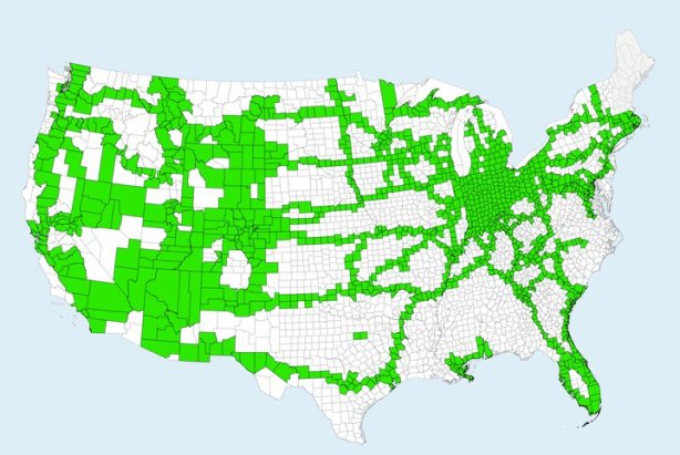
A couple of my colleagues, Nick Wise and Emily Fekete, produced what they called “County Life Maps” earlier this year, highlighting the counties they had visited in the United States, and urged me to do the same. I was more than willing to oblige, and so I came up with this (kind of hideous looking) map to share with them, showing that I had visited 1340 counties in 46 states:

I know, not my best cartographic work, but it was done in a half-hour’s time using an open-source GIS on OSX (that was back before I discovered Parallels and was still experimenting with that stuff).

Lately, though, I’ve been thinking about the importance of autobiographical geographies (“geoautobiographies?”) and how they shape personal experience, memory and perception. It is difficult to write about these geoautobiographies without going into tremendous depth because sharing the full richness of a personal sensory experience is a difficult task to verbally express.

So, I thought, what about making some maps? I’ve done it a little bit in my brief exercise in impressionist geography (“50 States, 50 Words“) and well…. making maps to express an autobiographical experience — in this case, travel — isn’t too easy. Sure, the map above shows counties that I’ve visited. It doesn’t show where I’ve visited in those counties, how often I’ve visited those counties, how long I spent there, or how recently I had visited. It’s a pretty one-dimensional display in that way. Okay for what it is, but it needs more detail.

Now, to be fair, I couldn’t add more detail to these displays at the county level without spending a considerable amount of time and energy, doing significant autoethnographic research with my family, recording each vacation and each trip with impossibly significant detail that memory simply doesn’t permit. So, I’ve zoomed out to the state level for this little exercise in geoautobiographical cartographic visualization, and used states in the U.S. Sure, I’ve been outside the U.S., but I am fairly proud of my depth of travels within this country.

So, let’s start out with states I’ve visited. Simple enough:

Black means yes, light gray means no, easiest map to ever make. I’ve been to 46 out of 48 states. I’m hoping to get to New Hampshire and Maine this summer. Alaska and Hawaii are probably more distantly in the future. Of course, this map suffers from the same problem as the “County Life Map” in that the data is treated as a container binary — meaning, the map either has a “yes” or a “no,” with no room for additional detail in terms of spatial differentiation, frequency, or temporal occurrence.  I made it this ugly ugly black to point out the flaw of this binary.  In other words, a state I lived in for 24 years (Indiana) gets the same symbology as states I visited once for 35 minutes (Delaware).

How to remedy? How about looking at intention behind the visit.

Obviously, the number of options have increased, though I’ve used a qualitative symbology again because it’s difficult to make an intention quantitative. Instead of two classes, I’ve got four: have lived there, have visited as a destination, have visited but not as a destination, or have not visited. Part of the goal of choropleth maps, though, is to differentiate spatial data. In this case, over 75% of our data points are in the same class: states I’ve visited as a destination.

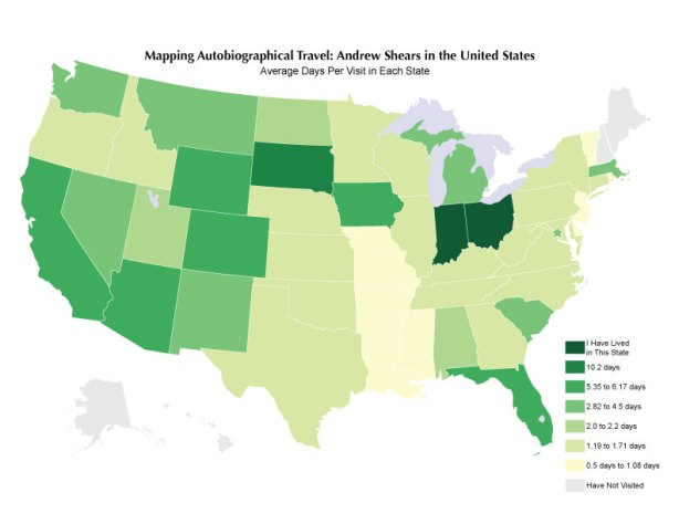
Let’s go quantitative, then. How about number of visits, which I’ve reckoned from an approximation of number of times I’ve set foot in the state. It’s a difficult thing to put together, though my memory of travels is probably better than any autobiographical memory, and in some cases these are best guess estimates.

Now, looking at this map, a couple of things stick out to me. For one, it just doesn’t feel right. Most experienced cartographers will tell you that, if they’re familiar enough with the data, the map has to present that data in a way that “feels” right. That’s one reason I think that cartography course should never, EVER be eliminated by GIS courses, but I digress. Point is, this doesn’t pass the feel test. Why? Number of visits seems to privilege proximity to home; indeed, small trips or even the running of errands can easily take someone to a neighboring state. At the same time, though, it also privileges drive-through states. I’m not saying these states are like McDonald’s, it’s just that some of these states (Tennessee, Georgia) just happen to be on the routes to destination points (Florida) and hence received two visits from me during each family vacation. One reason it doesn’t feel right, though, is that much of the traveling I did, especially as a child, was to drive somewhere and stay at that destination for a week or more. In this case, those destinations only get one visit per trip, even though the experience of being there measures far more in my autobiographic narrative. So, let’s look at how many times each state was a destination for a trip.


This map is a bit more reflective of my travel patterns, I think, because it manages to display that quality of intention in a quantitative fashion (number of visits). But then again, I think this is too raw. Sure, Kentucky may have been my destination seven times, but I’ve been there many many more times. Shouldn’t the fact that most of my visits to Kentucky are drive-throughs impact how I look at the state? Sure. So, here’s a map looking at percentage of times each state was a destination, out of total visits.

But I’m still not happy with it, because it doesn’t necessarily speak to how much impact the state had on me during my visit. Certainly the five destination-aimed trips to South Dakota are significant, but isn’t it more significant that I’ve chosen to spend 51 days of my life there during those four visits?

So, let’s try number of days spent in each state. Again, details are fuzzy, so in some cases, it’s an estimate, though I’m pretty confident in those estimates:

Now, this map “feels” much better. Florida and Colorado are lit up significantly, as they should be. Family vacations to Nevada, Washington DC, Michigan and Chicago also show up. Okay, maybe I should account for the fact that, after I made the effort to visit these places, I obviously spent different amounts of time in each. To do this, I went ahead and figured the number of days per visit, to combine the two quantitative maps into one normalized data set:


I like this one as well, because it highlights some important trips in my life. Sure, the old favorites of Florida and Colorado are still apparent, but now too are the longer times I’ve spent in the southwest, which was particularly important to forming my world views during my adolescence. These maps aren’t bad…. but they’re not everything either. Though South Dakota and Iowa also show up strongly (as they should; I spent 30 days in each for music camps during high school) they do not reflect the fact that it’s been a significant period of time since those long stays (South Dakota in 1998, Iowa in 1999).

So, now to add the temporal aspect. Year of last visit is the first step:

Of course, as is expected, it gives us nothing for frequency, but everything for currency.

I can add one detail to it, and that’s the qualitative attribute of intention. Here is a a map showing year of last visit as a destination, as that second step:

In each of these maps, you can clearly see my major trips for the year: Indiana to visit family, Washington DC for AAG 2010, Pittsburgh for our anniversary, and Kansas for GPRMAAG and to visit Emily.

But are these the most current? Because we are talking about experience, mental mapping and perception, shouldn’t I also include considerations for places I have concrete plans for visiting during 2011? That certainly affects how I’m thinking about places and even perceiving them.

This one shows the states I’ve already made plans, ones that are pretty much concrete, for visiting in 2011:

Yeah, it looks like I’ve got a busy year coming up, and I do…. but many of those states that I’m visiting in 2011 are a result of the long-way trip we’re taking to get to AAG 2011 in Seattle (Amtrak to San Francisco, rental car up the coast to Seattle with some dear friends, then Amtrak back to Cleveland). Everything else is from probable conferences. Of course, one of the very plans I mentioned way back at the beginning (a trip to New Hampshire and Maine, to finish out the lower 48 on my list) isn’t highlighted because it’s not set in concrete just yet.

Once again, though, the future plans map, like the visits map, prioritizes drive-through (or in this case, rail-through) states. What if it’s destinations only?

(Cartographic notes: All data classes broken using Jenks Natural Breaks Optimization method of classification, and colors provided for my colorblind ass by the incredible ColorBrewer resource. The base map is one I personally made a very, very long time ago.)

Posted: December 17, 2010 in 50 States, Maps, Philosophical Crap, Regions
Tags: , , , , , , , , , , , , , , ,