Archive for the ‘Maps’ Category

Every semester in my introductory classes, I do an assignment on push and pull factors, and how they relate to migration.  Of course, push and pull factors are a relatively easy concept to understand, in that push factors are those ideas about a place that “push” people away from living there, while “pull” factors are those perceptions which attract people.  It’s (really) old news for population geographers, and there have been plenty of critiques on the conceptualization, but it’s nice and tidy for getting intro-level undergrads interested in migration.

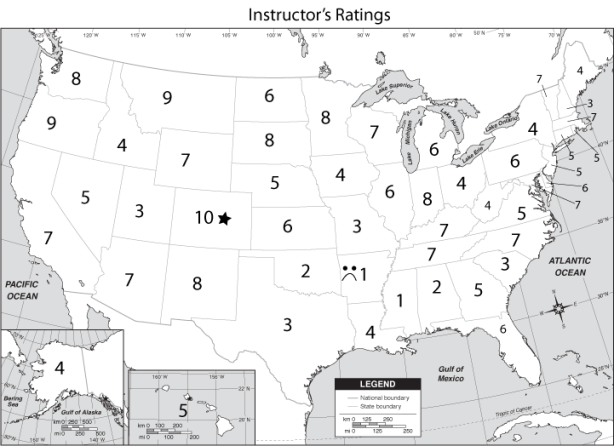
Usually, textbooks contain some sort of perception map to talk about this, based on mental maps of some undergrads at a random institution at which the textbook authors teach.  Like this one from whichever textbook:

That’s all well and good that a textbook shows this map, but it’ll maybe warrant a few seconds glance from the students (IF they open the text) and that’s it.  So, why not expand on the idea but have the students see what they think?

The assignment I give them is based on their own perceptions.  I have them simply pretend that they’ve graduated with their bachelors degrees and are now sought after by firms in every single state.  Then, I give them a map and have them rate, on first gut reaction, each of the 50 states a score of 1 (personal hell) to 10 (a land of milk and honey) as a potential place to live.  In groups, they come up with maps displaying averages of their ratings, and then the groups discuss why places are rated highly or lowly.  They’ve never got the resolution of analysis that the map above has, but it’s far more personal and links much better with what student interests are.

This, of course, leads into larger course discussions, like those about brain drain — few ever rate Ohio very well, and the power of perceptions — usually California and Hawaii are the most positively rated states, but few students have ever even visited either.  Of course, the discussion almost always touches on the lack of spatial resolution in this exercise, when one student gives New York a rating of 10 because they think NYC, but another gives it a 2 because the only New York they know is Buffalo.  It also leads nicely into topics like qualitative versus quantitative data, and serves as a really good gateway into healthy skepticism about statistical analysis, examining issues like sample size, interpolated data and other such critical thinking skills.

This semester, I put the assignment to two different classes at the University of Akron:

  • One Introduction to Geography course, mostly freshman with a few sophomores, 8:50am MWF.  The course enrollment is 41, but 30 were there to complete the assignment.
  • One Geography of Cultural Diversity course, all sophomores and juniors with two semesters of English composition as prerequisites., 11:00am TR.  The enrollment is 34, but only 25 were present that day.

Students were told to rate each state from 1 to 10, with 10 being the absolute best.  Beyond the ratings, they were to designate the absolute best with a star, and the absolute worst with a frown face.  After their group exercises and discussions, I collected the assignments and combined the data into some quickie maps, purposely ignoring cartography for sake of clarity, consistency and speed (really, I can do better!) and posted them on the course Facebook pages.  The results are what you see below.  I think they’re exceptionally interesting, not only in terms of which states are desired, but the differences between classes.

Map Set One: Raw Averages from Each Class. Averaged ratings from all students. Easy.


California’s the highest, followed by Hawai’i, Florida, North Carolina and South Carolina. Rhode Island is the worst, followed by North Dakota, South Dakota, Delaware and Connecticut.


In this class, North Carolina gets the highest accolades, followed by South Carolina, California, Ohio and New York. This class thinks that South Dakota’s the worst, followed by North Dakota, Nebraska, Minnesota and Idaho.

Map Set Two: “Stretched” Ratings from Each Class. Using some simple arithmetic, transformed the lowest rated state into a rating of 1, the highest rated into a rating of 10, and stretched the ratings in-between.  A good way to open the discussion about data manipulation as a true window into respondent intention.  Of course, the rankings will be identical.


Map Set Three: Best State Votes. A simple count of how many students, in each class, rated a state as the most preferred.


Not surprisingly, California received the most votes. More surprisingly, Florida got many more votes than Hawai’i (the second-highest rated state in this class).


In the course with more upperclass students, Ohio actually received the most votes, followed by the highest rated North Carolina, then California.


Map Set Four: Worst State Votes. A simple count of how many students, in each class, rated a state as the least preferred.


North Dakota and Alaska tie for being rated the worst most often, followed by Kansas. Note that Ohio received two votes, and class-wide favorite California was deemed the worst by one student.


In this case, North Dakota is joined by both Alaska Louisiana, followed by South Dakota and Texas. Notice that another favorite of this class, Florida, received one worst state vote.


Map Five: My Ratings. I always end up being asked what my ratings are, so I figured it’s fair to share.  I always make my own map and post it alongside the combined maps that I put on Facebook.  Here’s mine for this year… and oddly enough, it too changes every year.


That’s enough for now. Maybe I’ll revisit this topic later this week and include some of the students’ explanations behind their ratings.

We usually have to stress to students in introductory geography classes that, despite the insistence of their high school football coach, er…. social studies teacher, that geography is not the memorization of maps.  I usually have an exercise to stress this on the first day of class, in which I have the students each draw mental maps of the world, using nothing but as many blank sheets as they like.  I wrote about this a couple weeks back, with examples of what they submitted.  It usually serves as an eye-opening experience for them, and they usually let out a big sigh of relief when I tell them it’s the last time they’ll be drawing maps for me.  Of course, I use it as a nice segue into what geography is really looking at, analyzing a selection of the maps on the overhead.

But, keeping in mind what the larger perception of our field is, that is either memorizing maps or reading National Geographic, I wondered something last night: though I have my students draw a map of the world to show that memorizing isn’t everything, I don’t know that I’ve ever done the exercise myself, and certainly not after admitting to myself that I was indeed a geographer in 2002.

I figure I should know a thing or two about the world, and maps, being that I’m trained as a cartographer and that I’ve got a frickin’ PhD in geography — see?  Even I fall into that trap — and even beyond that I was the MVP of the World Geography Bowl in 2008 and runner-up a few other years (which is just as unbelievably nerdy as it sounds, but I got a plaque!)

So, last night, I sat down for a few minutes and drew a map.  What I came up with was, well, pretty messy and it took up parts of four sheets, but I scanned it and used Photoshop to put it together and… voila!   (click on it for a larger size)

Obviously, in looking at it, I’ve already noticed some factual problems, omissions and other issues.  But, I’m going to leave it as it is, a snapshot of what my brain was thinking on December 18, 2010 at 11:50 pm.

And just like my other geo-autobiographical pieces, I’m leaving it 100% up to your interpretation.

A lot of travelers — and especially geographers — like to keep track of numbers of places they’ve been…. countries, states, continents, capitals, everything. It’s a nice way to reflect upon past experiences, and yes, of course, brag to one’s friends about those travels.

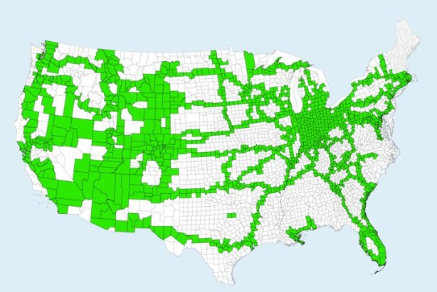
A couple of my colleagues, Nick Wise and Emily Fekete, produced what they called “County Life Maps” earlier this year, highlighting the counties they had visited in the United States, and urged me to do the same. I was more than willing to oblige, and so I came up with this (kind of hideous looking) map to share with them, showing that I had visited 1340 counties in 46 states:

I know, not my best cartographic work, but it was done in a half-hour’s time using an open-source GIS on OSX (that was back before I discovered Parallels and was still experimenting with that stuff).

Lately, though, I’ve been thinking about the importance of autobiographical geographies (“geoautobiographies?”) and how they shape personal experience, memory and perception. It is difficult to write about these geoautobiographies without going into tremendous depth because sharing the full richness of a personal sensory experience is a difficult task to verbally express.

So, I thought, what about making some maps? I’ve done it a little bit in my brief exercise in impressionist geography (“50 States, 50 Words“) and well…. making maps to express an autobiographical experience — in this case, travel — isn’t too easy. Sure, the map above shows counties that I’ve visited. It doesn’t show where I’ve visited in those counties, how often I’ve visited those counties, how long I spent there, or how recently I had visited. It’s a pretty one-dimensional display in that way. Okay for what it is, but it needs more detail.

Now, to be fair, I couldn’t add more detail to these displays at the county level without spending a considerable amount of time and energy, doing significant autoethnographic research with my family, recording each vacation and each trip with impossibly significant detail that memory simply doesn’t permit. So, I’ve zoomed out to the state level for this little exercise in geoautobiographical cartographic visualization, and used states in the U.S. Sure, I’ve been outside the U.S., but I am fairly proud of my depth of travels within this country.

So, let’s start out with states I’ve visited. Simple enough:

Black means yes, light gray means no, easiest map to ever make. I’ve been to 46 out of 48 states. I’m hoping to get to New Hampshire and Maine this summer. Alaska and Hawaii are probably more distantly in the future. Of course, this map suffers from the same problem as the “County Life Map” in that the data is treated as a container binary — meaning, the map either has a “yes” or a “no,” with no room for additional detail in terms of spatial differentiation, frequency, or temporal occurrence.  I made it this ugly ugly black to point out the flaw of this binary.  In other words, a state I lived in for 24 years (Indiana) gets the same symbology as states I visited once for 35 minutes (Delaware).

How to remedy? How about looking at intention behind the visit.

Obviously, the number of options have increased, though I’ve used a qualitative symbology again because it’s difficult to make an intention quantitative. Instead of two classes, I’ve got four: have lived there, have visited as a destination, have visited but not as a destination, or have not visited. Part of the goal of choropleth maps, though, is to differentiate spatial data. In this case, over 75% of our data points are in the same class: states I’ve visited as a destination.

Let’s go quantitative, then. How about number of visits, which I’ve reckoned from an approximation of number of times I’ve set foot in the state. It’s a difficult thing to put together, though my memory of travels is probably better than any autobiographical memory, and in some cases these are best guess estimates.

Now, looking at this map, a couple of things stick out to me. For one, it just doesn’t feel right. Most experienced cartographers will tell you that, if they’re familiar enough with the data, the map has to present that data in a way that “feels” right. That’s one reason I think that cartography course should never, EVER be eliminated by GIS courses, but I digress. Point is, this doesn’t pass the feel test. Why? Number of visits seems to privilege proximity to home; indeed, small trips or even the running of errands can easily take someone to a neighboring state. At the same time, though, it also privileges drive-through states. I’m not saying these states are like McDonald’s, it’s just that some of these states (Tennessee, Georgia) just happen to be on the routes to destination points (Florida) and hence received two visits from me during each family vacation. One reason it doesn’t feel right, though, is that much of the traveling I did, especially as a child, was to drive somewhere and stay at that destination for a week or more. In this case, those destinations only get one visit per trip, even though the experience of being there measures far more in my autobiographic narrative. So, let’s look at how many times each state was a destination for a trip.


This map is a bit more reflective of my travel patterns, I think, because it manages to display that quality of intention in a quantitative fashion (number of visits). But then again, I think this is too raw. Sure, Kentucky may have been my destination seven times, but I’ve been there many many more times. Shouldn’t the fact that most of my visits to Kentucky are drive-throughs impact how I look at the state? Sure. So, here’s a map looking at percentage of times each state was a destination, out of total visits.

But I’m still not happy with it, because it doesn’t necessarily speak to how much impact the state had on me during my visit. Certainly the five destination-aimed trips to South Dakota are significant, but isn’t it more significant that I’ve chosen to spend 51 days of my life there during those four visits?

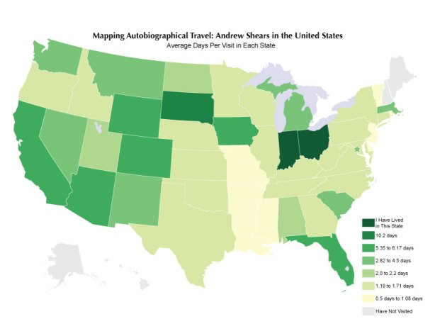
So, let’s try number of days spent in each state. Again, details are fuzzy, so in some cases, it’s an estimate, though I’m pretty confident in those estimates:

Now, this map “feels” much better. Florida and Colorado are lit up significantly, as they should be. Family vacations to Nevada, Washington DC, Michigan and Chicago also show up. Okay, maybe I should account for the fact that, after I made the effort to visit these places, I obviously spent different amounts of time in each. To do this, I went ahead and figured the number of days per visit, to combine the two quantitative maps into one normalized data set:


I like this one as well, because it highlights some important trips in my life. Sure, the old favorites of Florida and Colorado are still apparent, but now too are the longer times I’ve spent in the southwest, which was particularly important to forming my world views during my adolescence. These maps aren’t bad…. but they’re not everything either. Though South Dakota and Iowa also show up strongly (as they should; I spent 30 days in each for music camps during high school) they do not reflect the fact that it’s been a significant period of time since those long stays (South Dakota in 1998, Iowa in 1999).

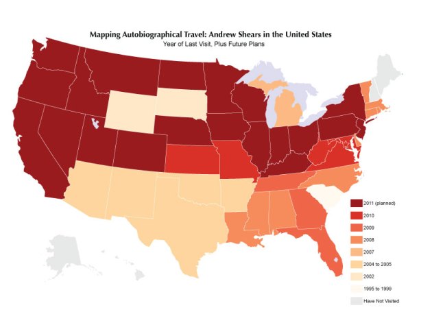
So, now to add the temporal aspect. Year of last visit is the first step:

Of course, as is expected, it gives us nothing for frequency, but everything for currency.

I can add one detail to it, and that’s the qualitative attribute of intention. Here is a a map showing year of last visit as a destination, as that second step:

In each of these maps, you can clearly see my major trips for the year: Indiana to visit family, Washington DC for AAG 2010, Pittsburgh for our anniversary, and Kansas for GPRMAAG and to visit Emily.

But are these the most current? Because we are talking about experience, mental mapping and perception, shouldn’t I also include considerations for places I have concrete plans for visiting during 2011? That certainly affects how I’m thinking about places and even perceiving them.

This one shows the states I’ve already made plans, ones that are pretty much concrete, for visiting in 2011:

Yeah, it looks like I’ve got a busy year coming up, and I do…. but many of those states that I’m visiting in 2011 are a result of the long-way trip we’re taking to get to AAG 2011 in Seattle (Amtrak to San Francisco, rental car up the coast to Seattle with some dear friends, then Amtrak back to Cleveland). Everything else is from probable conferences. Of course, one of the very plans I mentioned way back at the beginning (a trip to New Hampshire and Maine, to finish out the lower 48 on my list) isn’t highlighted because it’s not set in concrete just yet.

Once again, though, the future plans map, like the visits map, prioritizes drive-through (or in this case, rail-through) states. What if it’s destinations only?

(Cartographic notes: All data classes broken using Jenks Natural Breaks Optimization method of classification, and colors provided for my colorblind ass by the incredible ColorBrewer resource. The base map is one I personally made a very, very long time ago.)

This week is Geography Awareness Week, a designation that started in 1987 via presidential proclamation to promote geographic literacy in education and in the general public.  Each GAW has a theme; this year’s is freshwater, which isn’t a terribly interesting topic to me personally.  But, as an educator and a geographer, geographic literacy is something I find to be quite important.

Many semesters, in one or more of my teaching affiliations, I am assigned sections of World Regional Geography.  This course, which typically emphasizes helping students achieve a broad familiarity with all areas of the world using the geographic perspective of space and place, is usually a difficult one to teach.  Quite simply, the goal of this course is to provide a baseline of geographic literacy for students as part of a broader university education.   However, there is just too much real estate and too many details to cover, and to do anything or anyplace some form of justice in coverage, the semester moves far too quickly.  Add to this that many students walk in believing that the geography course is nothing but the memorization of maps, and instructors of World Regional Geography have a real challenge on their hands.

Of course, we all know that maps are not the end-all, be-all of geography; far from it, maps are only a small part of what geographers do.  At the same time, though, maps are useful tools that are crucial, especially to beginning students, in helping represent the world and provide a basis for understanding the more interesting aspects of our field.  With all of this in mind, I’m bringing forth an activity that I do on the first day of every World Regional Geography course I teach.  After we go over the syllabus, I hand each student a blank piece of Hammermill copy paper and give them the following instructions:

  1. Draw a map of the world.
  2. Label what’s important.

The open-ended instructions serve several purposes.  First and foremost, it brings a wide variety of responses, displaying the full range of geographic literacies amongst members of the class.  In this way, it’s a proxy, giving me a general idea what hand I’ve been dealt, so to speak, and what knowledges I have in the classroom to build upon.  Of course, as we already said, maps aren’t everything, but letting students draw one from scratch gives us a pretty decent idea what’s in their brains.  Secondly, it gives me a nice segue into an introductory lecture about what geography is, what the course is going to be, and so forth.

Sometimes, I get a few fantastic maps.  Usually, they’re somewhat putrid, as could be expected from a group of folks who’ve (perhaps) never had a class stressing anything approaching geographic literacy.  What’s interesting, though, is to look at these maps and read a bit more into them.

What you’ll see below is a few samples from a composite set of students in my World Regional Geography courses since 2008.  In that time, I’ve taught around 650 students in those courses at three campuses of two universities, all of which were in Northeast Ohio.  From there, I’m keeping all other details moot.  I’ve categorized these maps according to what I think they display, and provided some comments.  Click on any image for a bigger one.

The Really Rough – Sure, I said a lot of these maps are bad.  But there are many different kinds of bad, ranging from having no idea about much of anything on the earth’s surface, to having obviously heard of places before but just having no idea where those places are.  Let’s start with the roughest, and work our way to better ones.


No specificity of any places


Some knowledge of just the United States, identifying Canada, but nothing else


We’ve got continents, but they’re nowhere near the right places.


Lots of places identified, but they’re all a mess.


Africa’s to our south, and Mexico is connected to the US by the Panama Canal.


This person second guessed themselves…


And this one apparently had ice cream cones in mind that day.


Missing Continents Not Named Atlantis – I think it’s really interesting to look at some of these maps and notice that, apparently, in the minds of some of these folks, a few billion people just don’t exist.


In some cases, we only get North America


In other cases, we only get the western hemisphere


Missing both Africa and Asia was surprisingly common.


In fact, Africa was the most common omission.


Sometimes Africa was joined in its disappearance by Europe, South America and Australia.


Yes, believe it or not, Europe even disappeared… more often than Australia or Antarctica, in fact.


Peculiarities and Oddities – Sometimes, what shows up on these maps… well, it leaves you scratching your head, or just in wonder.


This one was submitted by a Chinese student.  I found it refreshing the difference of detail, and how fuzzy the Americas were.


We now know how to get to Brandon’s house.  We also have the International Space Station and Mars as points of reference… but no Europe.


This student had already labeled bodies of water as the Atlantic and the Pacific, and hence didn’t exactly know what to call that expanse between Europe and North America.


Ahh, Texas… the testicles of the United States.  And Russia is Dumbo’s geographic incarnation.


One recurring theme with this assignment is the usage of insets for Alaska and Hawaii, common on U.S. maps, even when they’re unnecessary.  Are we doing an adequate job of explaining exactly how maps represent the earth if this kind of confusion runs rampant?


We’ve got another Alaskan inset, but notice the very thick border to separate Mexico from the U.S.?


Intentionally Funny – Some students try to have a little fun with their maps.  I give them props.


This one provides the location of Viking Land and the Bermuda Triangle


The location of Hogwart’s (complete with a game of quidditch).


Tom Hanks and Wilson, marooned in the southern Atlantic


Some rather blunt descriptions of places, including a patriotic motif for the U.S.


Some Pretty Good Ones! – Just when you’re about to bang your head into the wall, declaring that there is no reason to bother, you get a few like these that give you a glimmer of hope, and keep you fighting the good fight, preaching the gospel of geography to another semester of young minds.

So, there you have it.  Though some of our students come into our classrooms with a pretty good geographic literacy, we should be AWARE (haha) this week that many more of our students are in need of that exposure.   If some students are capable of constructing decent representations of the earth on the first day of class, then every student in the room is potentially capable of doing the same thing, with a little help.  For the future generations to become productive and contributing citizens of the world, we need to help bring our students to a better familiarity with the world around them…. which coincidentally enough, is what Geography Awareness Week is all about.

Geographic literacy is a so important that we must not lose focus on that objective, we must realize that our job is never finished, but that our job isn’t impossible if we work together all levels of educators to emphasize its importance.  And then, if we keep working at it, I’ll get more students with maps like those at the bottom of this entry than those at the top…. and I’ll be able to bring in far more details to understanding the world than just the basics.

Program Note: This is going to be my last blog for until at least next week.  I’m defending my dissertation tomorrow morning, and I’ll be taking the weekend off to relax and enjoy (hopefully) being completely finished.

Pop music is an interesting animal, in that it’s a genre that is defined to exist without a solid stylistic definition.  Certainly, much pop music has common threads, such as relatively simple tonal and harmonic properties, in some cases a beat for dancing, and nearly always, a “catchy-ness” that allows a song to get stuck in one’s head ad infinitum.  Indeed, the genre of pop music is at least partially defined by the term from where the genre’s title originated: popular.  We’re looking at music that is the most popular.

How do we measure if music is popular?  Album sales is a pretty easy one to use, because that provides some quantitative data that we can use as a basis for solid comparison.  Sure, using album sales has its flaws — no input for Youtube views, Pandora plays, radio airtime, pirated copies, casual radio fanhood, or even concert attendance — but it gives us a place to start.  Another unfortunate flaw is that it tends to prioritize older, or at least, long-established artists in two ways.  First, today’s album sales aren’t what they used to be, according to the RIAA and it’s obnoxious vendetta against pirates.  Second, and perhaps most crucial, it takes a while for any artist to catch up with the best-seller in their state.  I mean, Lady Gaga, for all of her success (11 million albums sold in the US), has a long way to go before catching Billy Joel (80 million), but Mr. Joel has had a few more decades to sell.  Lady Gaga is hopelessly unlucky there; if she’d been from Alaska, for instance, she’d been on top long ago.

Now, how do we determine what state an act represents?  For solo artists, birthplaces, childhood homes, where they spent formative years, places they lived are all considerations.  For bands and groups, place of formation is the biggest one, followed by places of other important milestones, and birthplaces of members. It may not be the best set of criteria, but it’s something with solid information on which to base the location.

Does taste have anything to do with this map?  Yes, and no.  Not my tastes, per se; I certainly wouldn’t have chosen a number of these artists if my personal tastes were the method for choosing pop artists to represent each state.  But in a way, it does represent, to a point, tastes of the wider public as represented through album sales.  Now, of course, these aren’t the 50 (er, 52…) most popular artists in U.S. history.  I mean, look at Michigan… Madonna’s commercial success outranks the entirety of amazing Motown groups, which in the opinions of many (including myself) are musically superior to The Material Girl.  She also wipes out Eminem, whose album sales would have outranked the representative artists of some 31 other states, if only he’d been from there.

  • Alabama – The band Alabama was formed in Fort Payne.
  • Alaska – 36 Crazyfists* is a metal band formed in Kenai.
  • Arizona – Linda Ronstadt was born and raised in Tucson.
  • Arkansas – Johnny Cash was born and raised in Kingsland.
  • California – The Eagles formed in Los Angeles.
  • Colorado – India.Arie is from Denver.
  • Connecticut – Michael Bolton was born and raised in New Haven.
  • Delaware – George Thorogood was born in Wilmington.
  • District of Columbia – Marvin Gaye started his career in Washington.
  • Florida – Tom Petty & the Heartbreakers formed in Gainesville.
  • Georgia – Alan Jackson was born and raised in Newnan.
  • Hawaii – Bette Midler was born in Honolulu.
  • Idaho – Built to Spill was formed in Boise.
  • Illinois – The band Chicago formed in the city of Chicago on the campus of DePaul University.
  • Indiana – Michael Jackson was born and raised in Gary.
  • Iowa – Andy Williams was born in Wall Lake.
  • Kansas – The band Kansas originated in Topeka.
  • Kentucky – John Michael Montgomery was born and raised in Danville.
  • Louisiana – Tim McGraw was born and raised in Delhi.
  • Maine – Dan Fogelberg maintained a residence through much of his later life in Deer Isle.
  • Maryland – Tupac Shakur spent his teenage years in Baltimore.
  • Massachusetts – Aerosmith formed in Boston.
  • Michigan – Madonna was born and raised in Bay City.
  • Minnesota – Prince, born raised and still lives in Minneapolis.
  • Mississippi – Britney Spears was born and attended high school in McComb.
  • Missouri – Tina Turner attended high school in St. Louis and got her musical career started in clubs there.
  • Montana – Several members of The Decemberists were born and raised in Montana.
  • Nebraska – 311 formed in Omaha.
  • Nevada – Frank Sinatra was in residence in Las Vegas for a good part of the 1950s and 1960s.
  • New Hampshire – The Queers*, a pop-punk band, were formed in Portsmouth.
  • New Jersey – Do I have to explain this one?
  • New Mexico – John Devner was born in Roswell.
  • New York – Billy Joel was born and raised in New York City.
  • North Carolina – Randy Travis was born and raised in Marshville.
  • North Dakota – Lawrence Welk was born and raised in Strasborg.
  • Ohio – Rascal Flatts was formed in Columbus.
  • Oklahoma – Garth Brooks was born and raised in Tulsa and started his music career in Stillwater.
  • Oregon – Elliot Smith* lived most of his life in Portland.
  • Pennsylvania – Boyz II Men was formed in Philadelphia.
  • Puerto Rico – Ricky Martin is originally from San Juan.
  • Rhode Island – Several members of Talking Heads met in college at the Rhode Island School of Design in Providence.
  • South Carolina – Hootie and the Blowfish formed in Columbia.
  • South Dakota – Indigenous is a Native American blues band based in the town of Marty.
  • Tennessee – Elvis Presley had a longtime home in Graceland
  • Texas – George Strait was born and raised in Houston.
  • Utah – Jewel was born and raised in Payson.
  • Vermont – Drowningman*, a hardcore punk band, was formed in Burlington.
  • Virginia – Dave Matthews Band was formed in Charlottesville.
  • Washington – Too ironic, this one.  Home of Nirvana and Pearl Jam, but the best-selling artist from Washington?  None other than Kenny G, who was born and raised in Seattle.
  • West Virginia – Michael W. Smith was born and raised in Kenova.
  • Wisconsin – Violent Femmes formed in Milwaukee.
  • Wyoming – Spencer Bohren* was born and raised in Casper.

*- means that hard albums sales data was not available, top-selling status uncertain but inferred from artist discography and other online resources.

So, do you like your state’s representation?  Are you embarrassed by it?  (I’m looking at you, Misssissippi!)  What do you think?

Wow.

That’s all I can say about the feedback from last week’s blog post, 50 States, 50 Television Series.  It went viral, getting spread all over the internet quicker than I knew was possible.  Thanks to everyone who posted it, everyone who commented on it… hell, everyone who looked at it, all 18,000 views.  I certainly never intended for it to be so widely read.  Honestly, I never thought anyone would give two craps about it.  I just thought it was something to have a little fun with.

Even still, this little blog got more traffic, more comments and more debate than ever before — not to mention the extensive comment debates occurring on sites such as The Huffington Post and others.  I’ve been following the debate and the critiques — for the most part — and though it’s a little frightening how seriously some people took the original map, I am certainly not one to ignore valid criticism of my work, even if it’s a goofy, totally subjective list I came up with one time late on a Saturday night.

So, that said, I’ve remixed the map just a bit taking the popular feedback into account.  Please take note, it’s not a revision of the first map.  No no, I stick by that one as my personal geography of states by TV shows, a snapshot of what I thought at that moment in time and based on my own preferences and experiences.  For more on personal geographies, impressionist geographies and other ideas with mental mapping, check out my recent post on the matter.  This map, though, takes into account the voices of those who commented to make a “People’s Choice” edition.  Now, the remixed map… click for a bigger version.

The biggest, loudest, and most common criticisms I received over the original?

  • “OH MY GOD!!! WHAT IS WRONG WITH YOU? THE MARY TYLER MOORE SHOW IS THE ONLY CHOICE FOR MINNESOTA!!!!!!!!1!!” Usually this was followed by some snide remark about how I was some young whippersnapper.  I do understand the immense popularity of this show and its influence on sit-coms… but yes, I am too young to have seen the show in its first run, and I never caught it on re-runs. So, I made the totally subjective choice of Coach in the original edition, and I now recognize that I am permanently a persona non grata in Minnesota.  Damn you Hayden Fox!
  • “No show for DC? We always get the shaft. We don’t even have a representative in Congress.” Yeah, I agree with you folks, it was a pretty crappy move for Congress not to give you representation, and it was a pretty crappy move for me to forget y’all.  The original map was intended to be part of a “50 States, 50 ____” series that no one would ever read.  Please accept The West Wing on the remixed map as an apology.  I also put Puerto Rico on this version, since they are very much in the same boat (representation-wise) as the District.
  • “I can’t believe, with all the shows out of California, you chose Baywatch. I hate you!” Okay, maybe I made that last part up.  With New York and California, it was so incredibly difficult to choose a show. Baywatch was some kind of default that I wasn’t totally happy with.
  • “Breaking Bad is the best show ever. You obviously know nothing about television.” Well, that’s a fair critique.  I’d never heard of Breaking Bad until I was encountered by approximately 200 of the show’s biggest fans.
  • “Walker: Texas Ranger? Do you have a Chuck Norris bias?” Guilty.  Well, sort of.  I have a Conan O’Brien Walker: Texas Ranger lever bias.
  • “Who in the hell is Billy the Exterminator?” Another subjective choice, in this case one that is associated so strongly with Louisiana because the show is so damn terrible.  It’s a really, really bad show.
  • “SOUTH PARK!!!!!!!!!!!!!!!!!!!!!!!!!!!!!!!!!!!!!!!!” I know, I know.  My first dalliance into this pop culture for states business was a movie map as a response to the one that floated around a few weeks back.  The TV map was my second, and I tried to avoid having any overlaps.  Devoid that context, I agree with you 100%.

A couple of things that were, well, just wrong, but that I read over and over again:

  • “The Virginian in Wyoming? Aren’t you a little confused?” No, The Virginian was a western about a Virginian who moved to Wyoming.  It was on TV a very long time ago.
  • “Wasn’t The Dukes of Hazzard from Hazard, Kentucky?” While there is a Hazard, Kentucky (and in fact, my father-in-law’s family comes from those parts), it’s not the same Hazard.
  • “In the Heat of the Night is a movie, you jackass.” Um, it was also a television show.  You jackass?

The rest of the feedback was relatively positive, though people were sometimes angrier over their state’s representation than I ever expected.  Folks, it was supposed to be fun!  But anyway, a summary of changes in this remix, and comments when appropriate.

  • California: Baywatch –>  Arrested Development.  Despite the number of shows based in Cali, Arrested Development was the one suggested by a huge majority of commenters. That’s cool with me.  I loved that show.
  • Colorado: Mork & Mindy –>  South Park.
  • District of Columbia: No choice –>  The West Wing.
  • Florida: The Golden Girls –>  Miami Vice.  Florida folks apparently don’t like being represented by an group of hilarious elderly women.
  • Illinois: Roseanne –>  Hill Street Blues.  Apparently crime is better than white trash, given the kind of feedback this one got.
  • Indiana: Parks & Recreation –>  Eerie, Indiana.  My home state is mostly devoid of good television.
  • Kansas: Jericho –> Gunsmoke.  A newer show traded for an old classic.  Nostalgia is a powerful thing.
  • Louisiana: Billy the Exterminator –>  True Blood.  Never seen it (vampires? no thanks), but it apparently has a pretty excited fan base.
  • Michigan: Freaks & Geeks –>  Home Improvement.  Freaks & Geeks ended way too soon.  Home Improvement could have never happened, far as I’m concerned, but apparetly people liked it.
  • Minnesota: Coach –>  The Mary Tyler Moore Show. Every person in America over the age of 40 was flabbergasted by my choice. No one under 40 seemed to care.
  • New Jersey: The Sopranos –>  Jersey Shore.  So many folks from New Jersey complained about having Sopranos fatigue.  Happy now?  😉  The other competitor was House, but House was farrrr outnumbered by people that watch that obnoxious reality stuff.
  • New Mexico:In Plain Sight –> Breaking Bad.  This show, though I’ve never seen it, apparently has a rabid following if comments and emails are any indication.
  • Nevada: Reno 911! –> Bonanza.  Niche show traded for an all-time classic.
  • Ohio: The Drew Carey Show –> Family Ties.  There was a pretty bitter comment war going on one of the websites between promoters of Family Ties and WKRP in Cincinnati.
  • Pennsylvania: The Office –>  It’s Always Sunny in Philadelphia.
  • Puerto Rico: No selection –> The Flying Nun.  The only English-language series I could find on the island, from the late 1960s and starring Sally Field.
  • Tennessee: Memphis Beat –>  The Grand Ole Opry.
  • Texas: Walker, Texas Ranger –> Dallas.  There was a bit of debate over this one, between Dallas and King of the Hill.  My preference is King of the Hill (I wasn’t old enough to watch Dallas), but Dallas fans far outnumbered anyone else.
  • Washington: Frasier –>  Twin Peaks.  Again, I was really too young to watch Twin Peaks and enjoy it.  I’ve never caught it on re-runs.  Several commenters wondered if the division between Frasier and Twin Peaks was something to do with an urban/rural divide.  Also, some people thought Frasier was too elitist.
  • Wisconsin: That 70s Show –>  Happy Days.  Another choice that initially confused the over-40 crowd.  I did catch Happy Days in reruns, and I always thought it wasn’t much good.  And “The Fonz” was soooooo creeeeeepy!

So, there you have it.  The remixed version.  Feel free to comment at will, and even post your own maps.  It’s a kinda fun exercise!

Program notes: I will be continuing this “50 States, 50 ____” series in the weeks ahead, because I’m having fun with it.  I’d love to hear some suggestions of maps to make.

Call it “Impressionist Geography.”

Impressionist painting, a largely Parisian art movement from the latter portion of the 19th century, dealt largely with rather pedestrian subject matter on a specific day and time, as it was seen and interpreted by the artist. A number of these paintings were focused on capturing the every-day scenery, as opposed to the exceptional or posed subject matters found in work from the Romantic era.  This has been seen by many art historians as a direct answer by painters to the newly developing medium of photography.  L’Absinthe by Edgar Degas, and Paris: A Rainy Day by Gustave Caillebotte are some notable examples. Other works would interpret a particular scene repeatedly  from one day to the next, creating a series of works with dramatically different results that depended not only on the subject matter itself, but the changing mood and life experience of the artist.  Claude Monet’s Water Lilies is probably the most famous example of this process.

What, then, is the point of this way of thinking? I am certainly not a Parisian painter living 150 years ago. The works by Degas, Caillebotte, Pissarro, Manet and others, those capturing life’s banal moments, serve as interesting windows into the past, as does the photography to which these artists were responding.  But here, I want to branch off specifically to Monet’s approach.  Monet focused on water lilies for most of the end of his career, creating some 250 paintings in the series, each unique and different.  While I could care little about water lilies, looking through the series as a progression gives a window not into the past itself, but into Monet’s life and experience.  Even if I don’t know Monet from Neptune — which, I don’t — it’s still interesting to see how those painting change as his experiences do, and to make inferences about his life.

We basically get to have an interview with a man who no longer exists… and just like any conversation, we project ourselves into forming an interpretation of what he presents.  Sure, his lilies are “pretty” and they certainly brighten the rooms of the galleries in which they hang today.  But to me, the true effectiveness of any work of art, or even any effective visual communication (this map is certainly no work of art…) is whether or not it makes you think about something.

This map is intended to be like one painting in a series of water lilies. The map above is inherently individual, autobiographical, and yes, impressionist. To create this map, I made a list of the states and used free association to compile the very first word I thought of for each state. I specifically tried to avoid city and town names, as well as human toponyms for the physical environment, though a couple of national parks are there.  And so, we have a one-word impression of each of the 50 states, as they existed in my head on the morning of November 9, 2010 at 8:35 am.  It’s a compilation of my experiences to-date, my thoughts, my mood, my brain’s function, my memory, my values, and even my social relationship as it exists at that exact moment in time, and it’s a snapshot.  And what is more banal to a geographer than a map of his or her home region?  If I made the a list of words for each state today, three days later, it would probably be slightly different.  If I was in a more negative mood the third time around, it would probably be even more different.  And so on.

This seems, on a glance, to be nothing more than a narcissistic exercise, suitable considering the innate self-loving evident in most personal blogs.  Is this any different than keeping a stash of old photos of oneself around?  Facebook provides an easy depository for this now, where you can click on your own profile picture and see an album of how you’ve changed, in visual appearance, since the album feature was created in 2006.  You can see your long-haired hippie phase, your goatee phase, and many more… and wow, haven’t you come a long way in just four years?  Such a map provides a snapshot of my brain, a one-time freeze-frame of my mental geography and what that says about me.  If nothing else, I can look back on the map in the future and see where I’ve been, so to speak.

I am purposely not providing any further explanation to the words as they are chosen.  Why?  Because if you look at this map, even if you don’t know me and don’t know a thing about me, you’re going to see these words and begin connecting the dots. You’re going to have your own perception of why I chose the words I chose, and you’re going to come up with other possibilities for your own map. It’s inevitable, because maps draw us in, and make us think.  You’re going to know me a little better than you did before, and whatever ideas you scratch from this map about me will be absolutely 100% true; “knowing” someone is only a compilation of impressions and perceptions about that person, because we can never truly be in their heads or walk in their shoes.

At the same time, while figuring out how you perceive my thoughts, with a little self-reflection, you’ll realize that you’re projecting your own thoughts, feelings and experiences into your interpretation, and then you learn more about yourself in the process.